Lead Designer ◦ 2020
With the revamped Performance Monitoring dashboard, you can customize your app performance metrics board to highlight the most important metrics for your app.
For example, if you’re releasing updates on a shopping app, you can select and track slow-rendering frames on the checkout screens. This helps ensure your customers are enjoying a seamless experience from start to finish.
— Nitin Kaushik
firebase engineering manager
Firebase is an app development platform that offers an entire suite of tools for developers, including tools to monitor app performance. This project spun out from a broader initiative to better understand and serve Firebase customers specifically interested in increasing app performance.
I lead the design work for this project, collaborating mainly with my product manager, design manager and various engineers to get their technical input. Along the way I received design feedback from the broader Firebase design team.
This project started as a discovery project utilizing different forms of research such as customer interviews, critical user journeys, and some light competitive research. The current dashboard experience failed to alert developers of real-time issues. This was especially problematic because Firebase is just one tool that developers use throughout their day and we want to make sure we are providing users with the most pertinent information in the easiest way possible.
The team decided to focus on the top two critical user journeys from the POV of a Firebase user:
The other user journeys were not as urgent in priority, such as spreading awareness of performance issues. We were focused more on the needs of existing users rather than acquisition of new Firebase users.
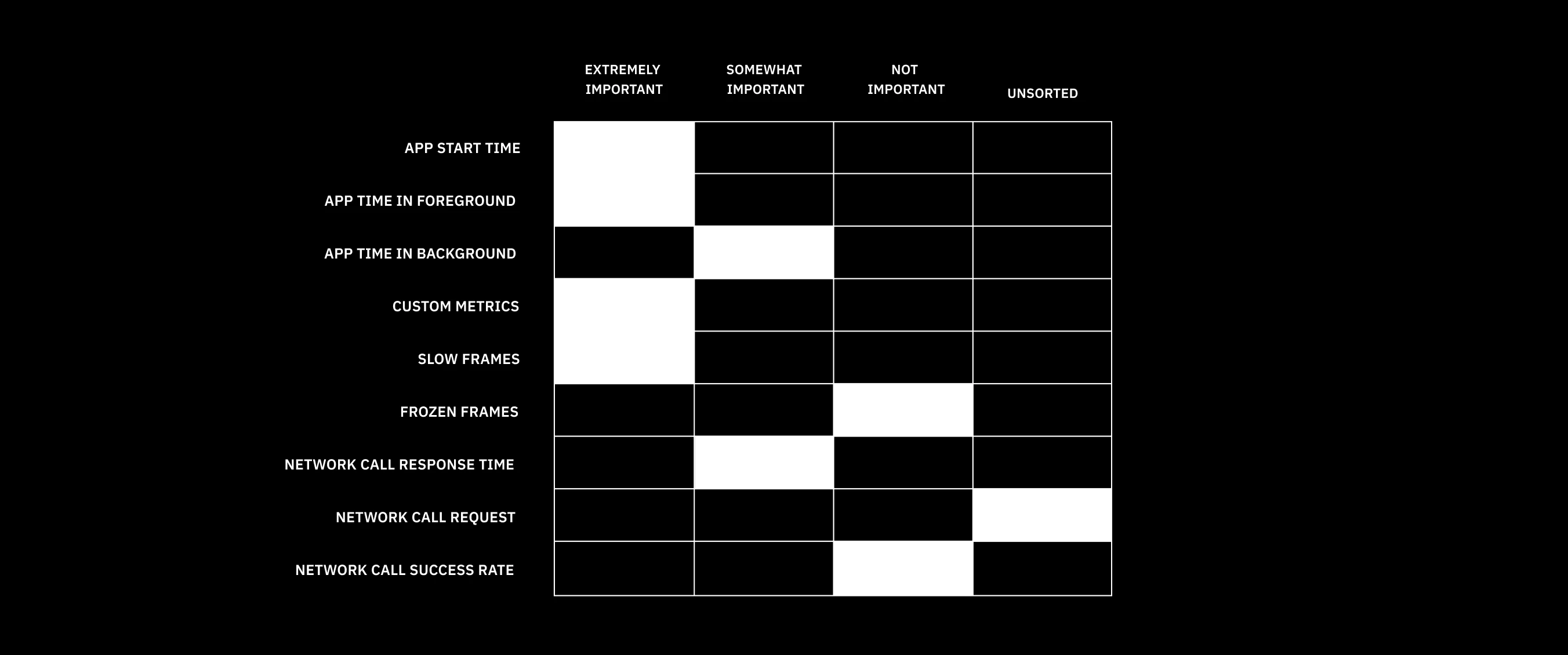
The unmoderated card exercise allowed participants to rate metrics on a scale of least important to extremely important
The unmoderated card exercise allowed participants to rate metrics on a scale of least important to extremely important
I collaborated with a Firebase researcher, Alisa, on an unmoderated card sort exercise. We showed research participants a list of metrics vetted by the team to understand how important they were to Firebase users. We also allowed for general feedback and the addition of other metrics. Early on, it became clear to us that each developer has their own opinion regarding what metrics are most relevant to them.. Which makes sense, because every app is different!
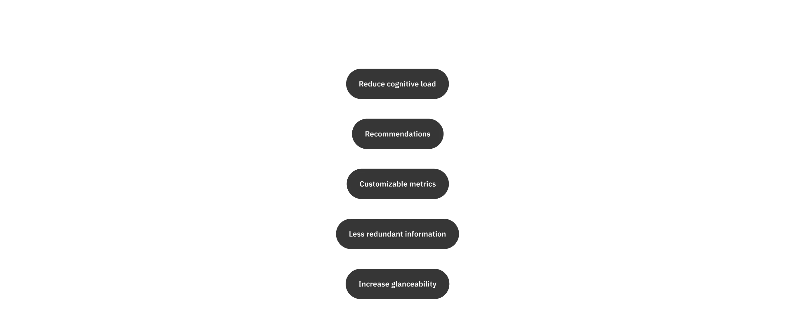
The main goal of this project evolved to focus on core functionality, specifically designing a way for developers to quickly and simply understand performance in real time. At the same time, it's impossible to design an experience that will be equally useful for everyone. Therefore, we needed a way for developers to customize this dashboard to suit their own unique needs.
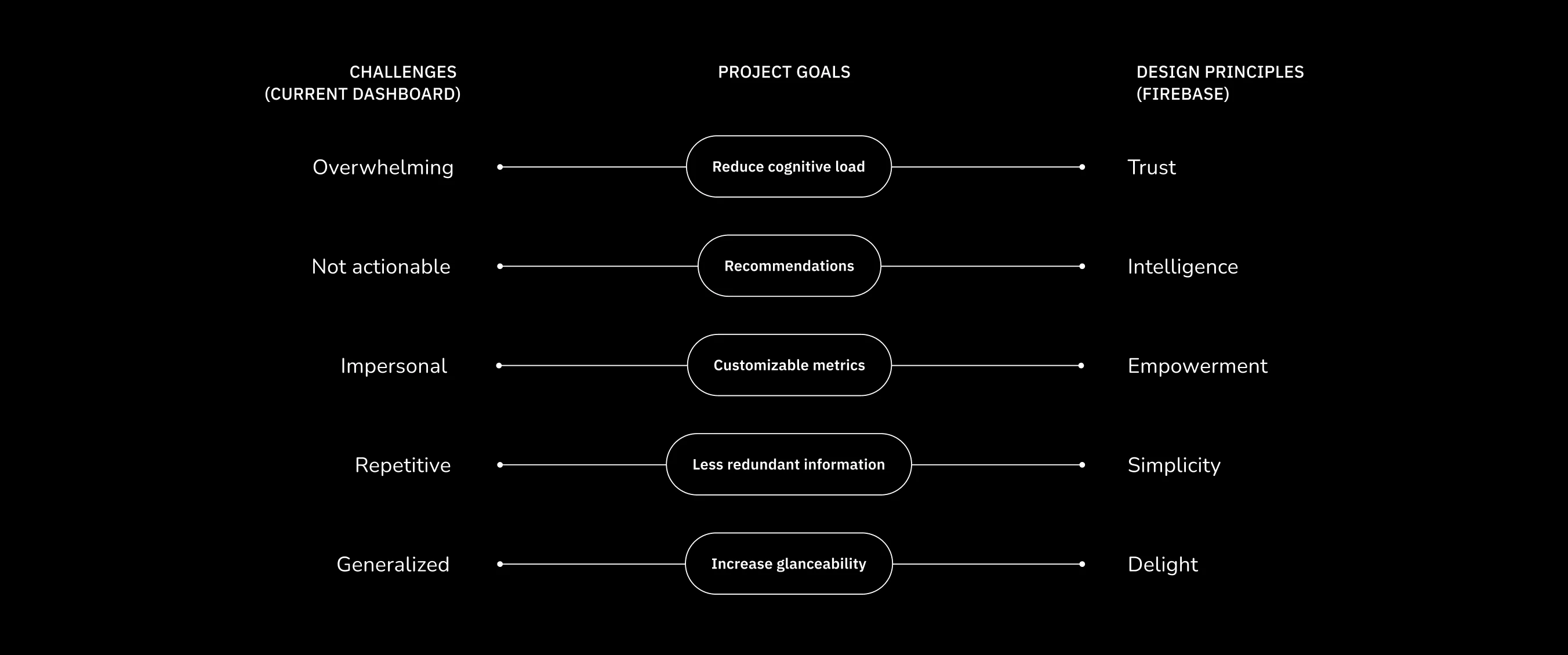
Connecting the challenges of the current dashboard with Firebase's design principles to create distinct design goals
Connecting the challenges of the current dashboard with Firebase's design principles to create distinct design goals
Connecting the challenges of the current dashboard with Firebase's design principles to create distinct design goals
Connecting the challenges of the current dashboard with Firebase's design principles to create distinct design goals
To come up with clear design goals, I combined these issues with Firebase's design principles. One specific principle — delight — stood out to me as I had just completed a different Firebase project that involved illustration and animation. Illustration is a significant part of the Firebase brand, not just in the marketing but embedded within the user experience.
In general, we wanted to move away from a generic, impersonal dashboard to one that empowers users through the act of customization. Showing users that we understand their core needs instills a higher level of trust in the dashboard experience and Firebase's larger suite of products. The challenge would be to design the dashboarrd in a way that is still relatively simple and intuitive.
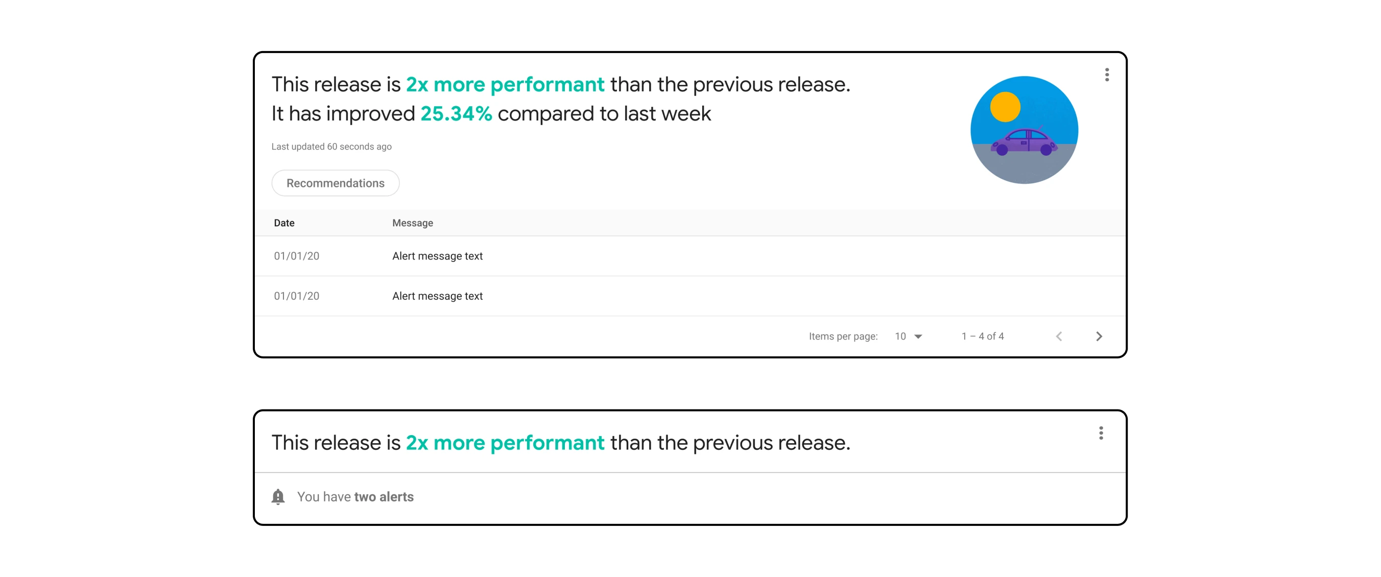
Collapsible "Health Check" module with notifications related to metrics
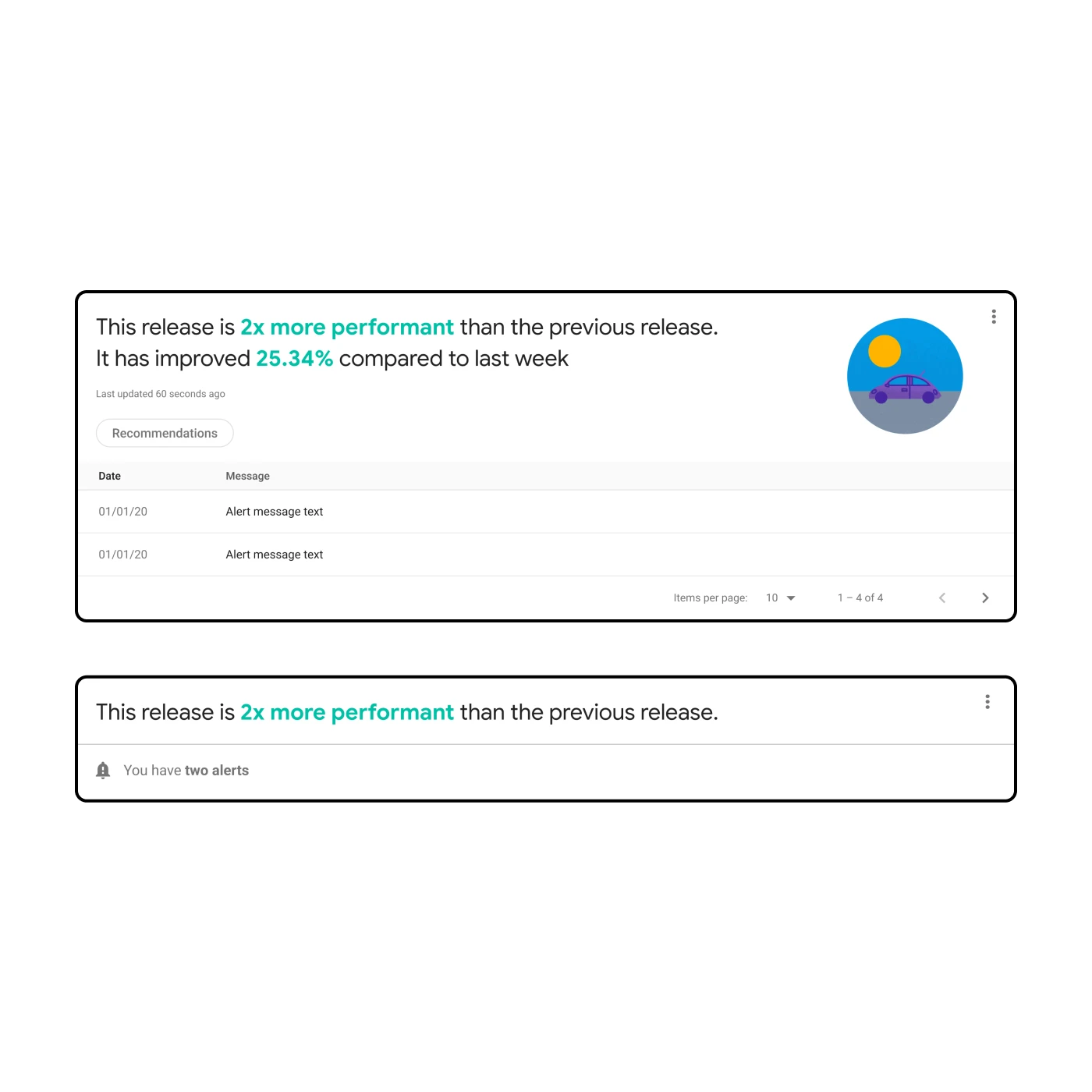
Collapsible "Health Check" module with notifications related to metrics
I had an idea for a "Health Check" module that would display a high-level indication of overall performance. I initially thought this would be ideal for incorporating illustration and animation. However, the more I thought about it and the more I talked about it with the team, I came to realize it was drawing attention away from what is most important: the metrics.
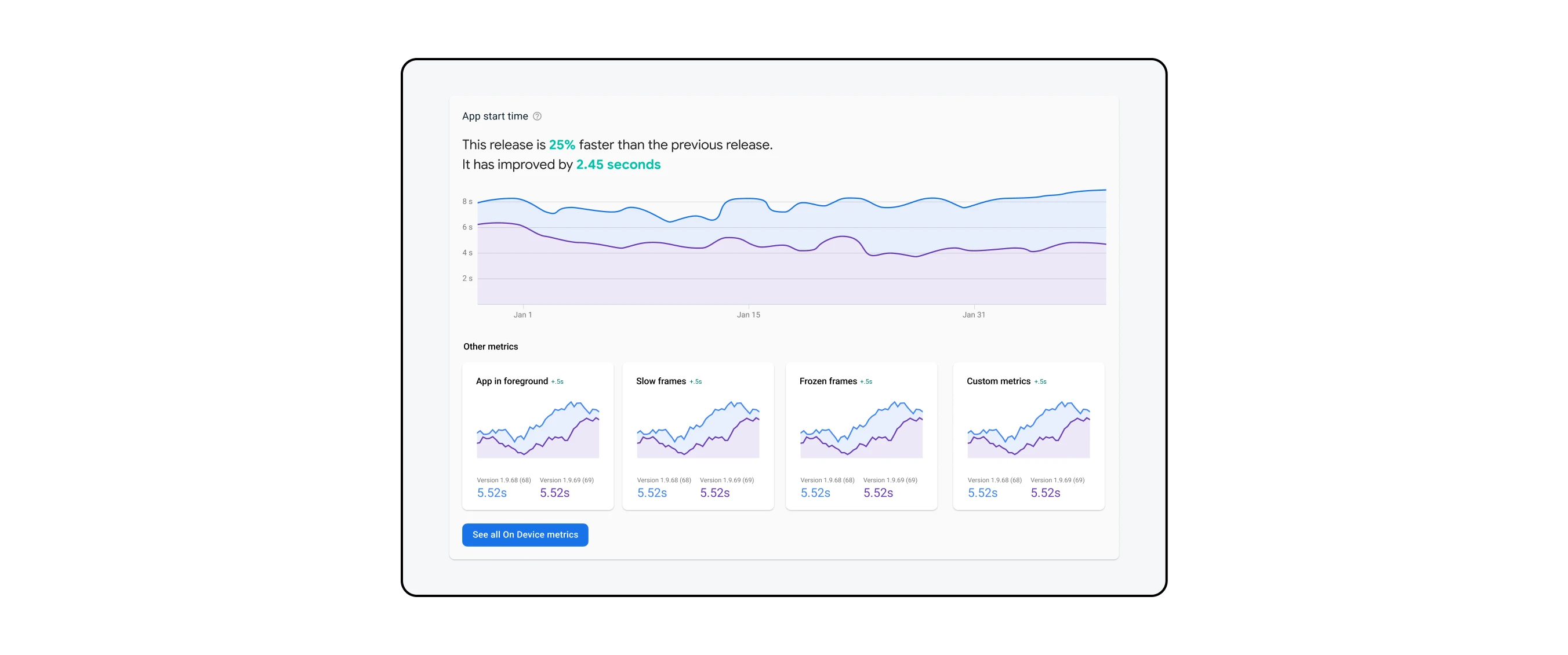
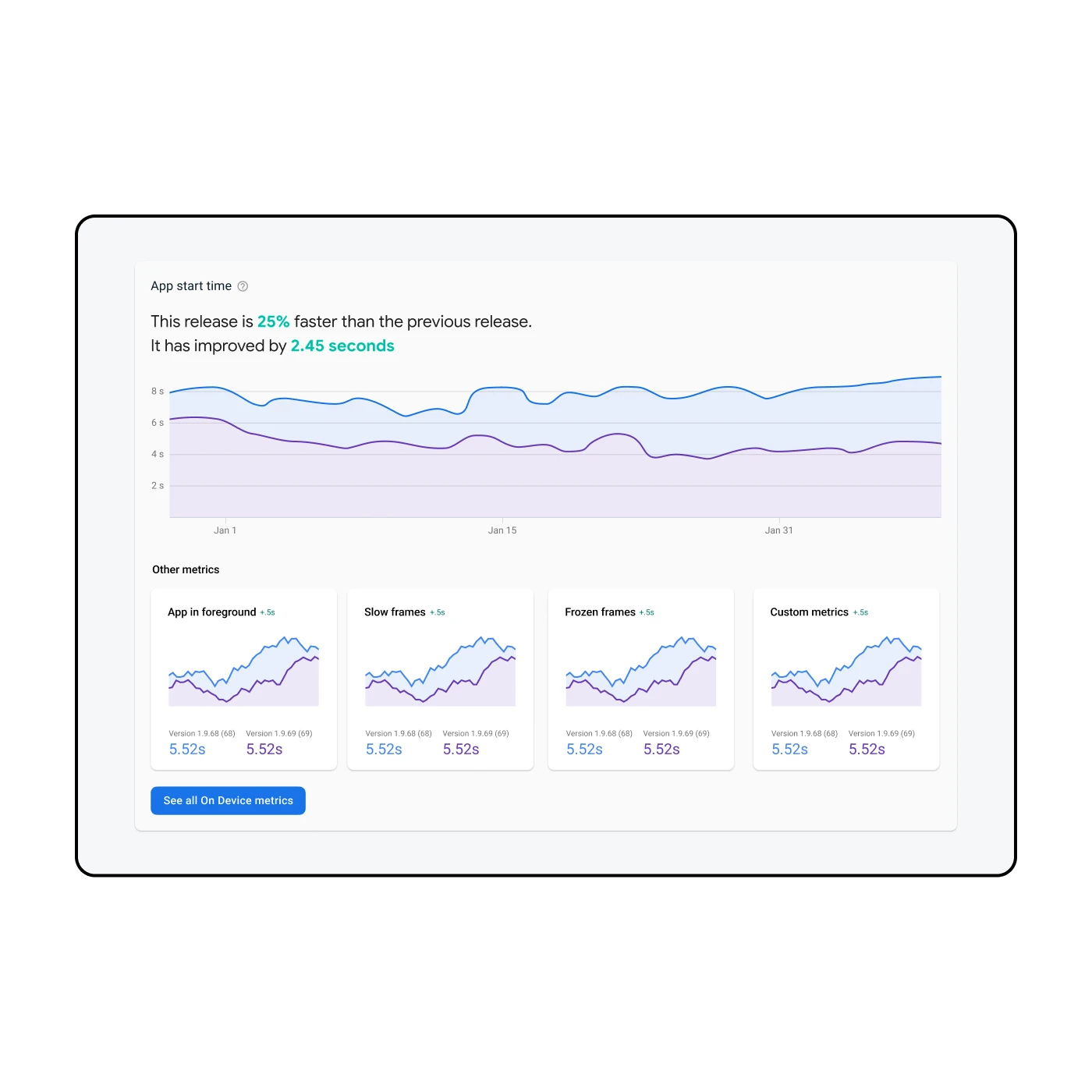
The main concept for the dashboard consisted of a larger "hero" graph and the introduction of customizable "mini" cards. While certain elements such as buttons and icons were derived from the Firebase design system, I was playing with new concepts with the intention that they could be re-used in other projects.
An older design iteration exploring the hero graph on top with mini cards below in a separate row
An older design iteration exploring the hero graph on top with mini cards below in a separate row
Another design iteration utilizing sparkline graphs in the mini cards
Another design iteration utilizing sparkline graphs in the mini cards
From there, the design iteration focused more on getting the data visualization right. I received design feedback and advice from one of the Firebase designers who specialized in data viz, Ryan, as well as other designers in feedback sessions. I also considered aspects like accessibility and interaction design. In the example above, one idea I played with was the use of sparklines. In the end, I decided these sparklines didn't add enough value to utilize so much space.
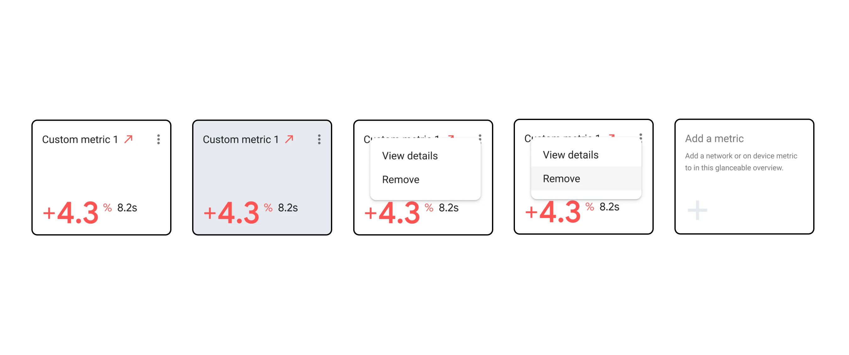
The revised mini card emphasizes the number rather than the sparkline while allowing for customization
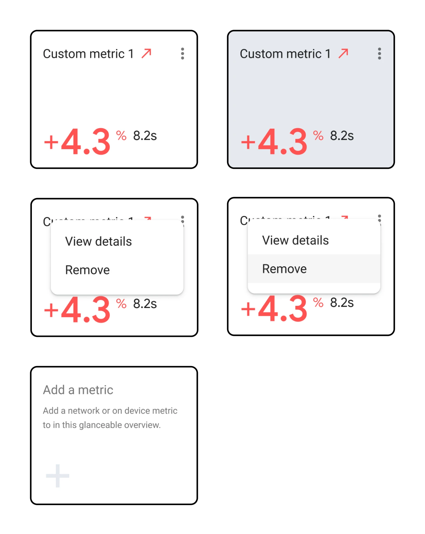
The revised mini card emphasizes the number rather than the sparkline while allowing for customization
Since I was designing for developers I wanted to make sure I was getting feedback from the engineers on my team. Along with my PM, we set up a cross-functional workshop to review design mocks, gather feedback and do a jamboard session together. That way, we were aligned as a team and had a strong direction going into the research sessions.
I worked with two engineers in particular, Melissa and Kim, who helped me understand what the metrics actually meant. While I was certainly no expert, I wanted to make sure that I understood enough to ensure the mocked up designs were accurate.
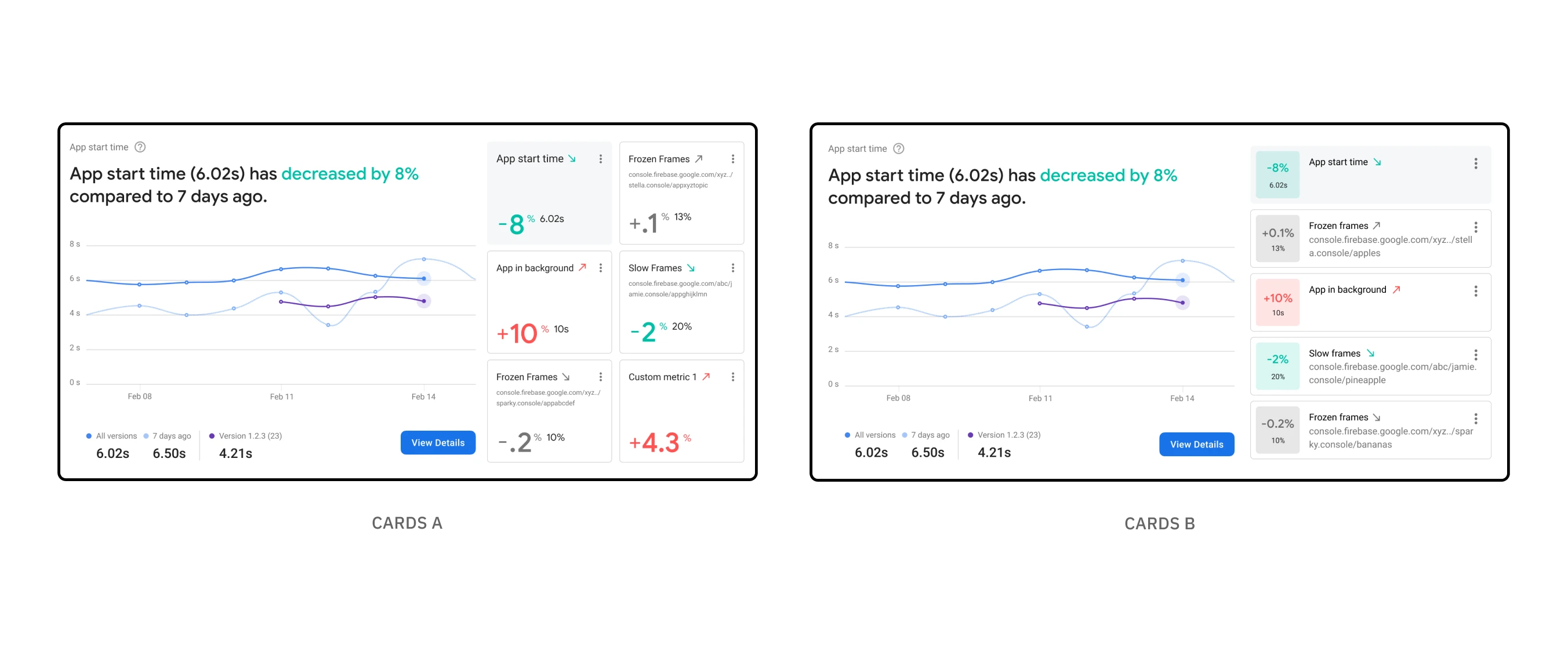
The two design directions that were A/B tested with developers
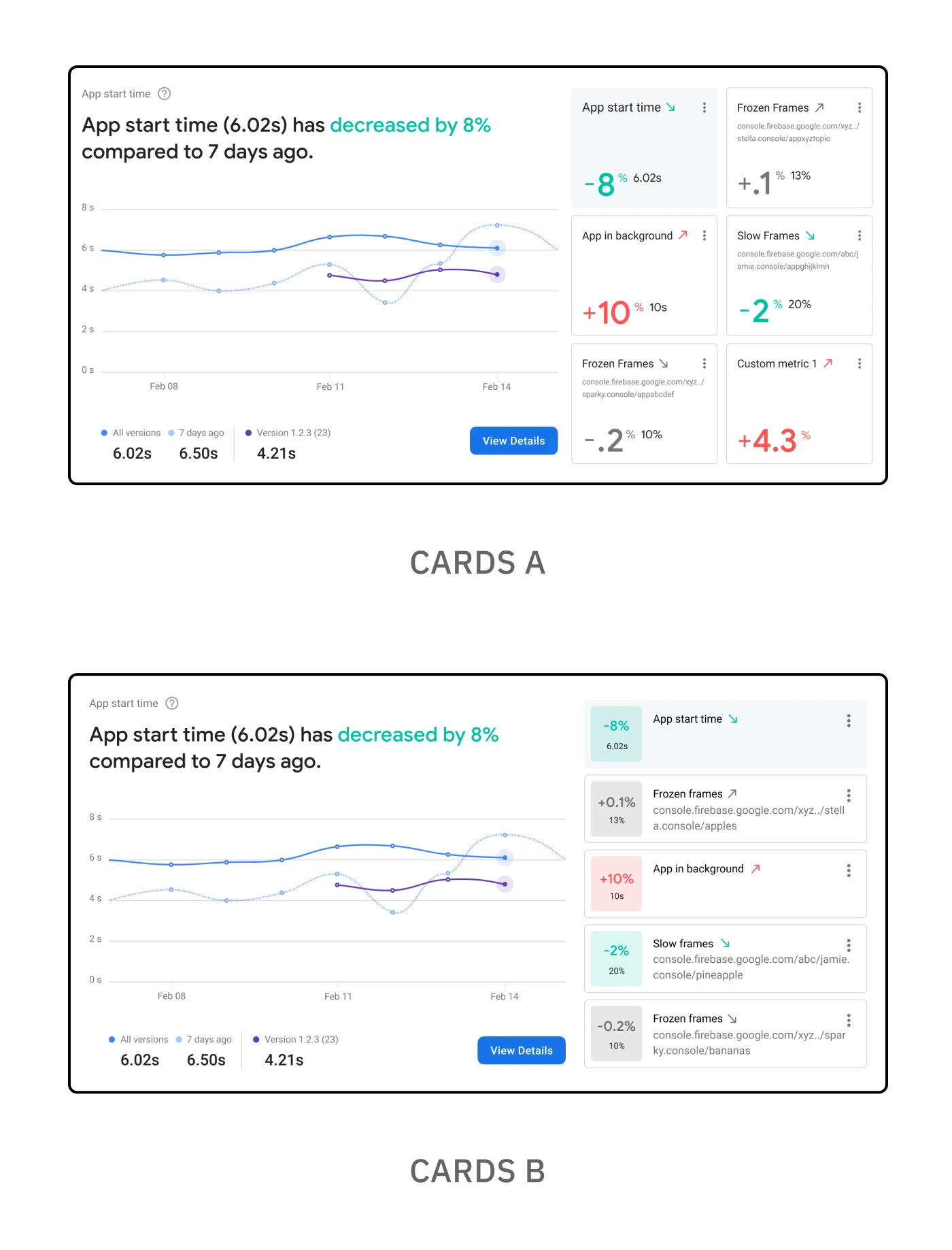
The two design directions that were A/B tested with developers

The two design directions that were A/B tested with developers
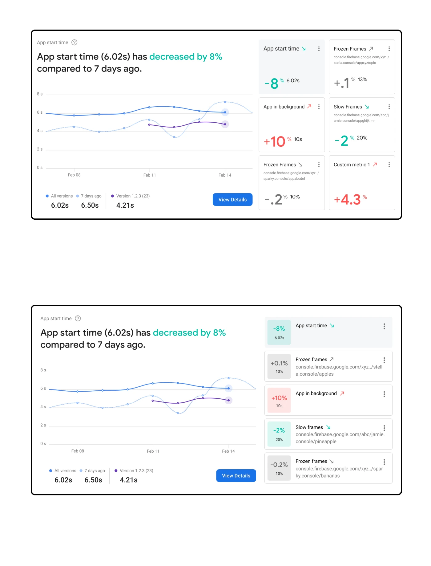
The two design directions that were A/B tested with developers
I partnered with research to speak directly with developers and get further feedback on mocks, an interactive prototype showing the customization of a card, and a follow-up exercise rating metrics. This included A/B testing two designs with different versions of the customizable cards.
The reason for Option B was to provide better glanceability in understanding positive, neutral, or negative impact on performance. Overall, the feedback was very positive for both options and validated that a customizable experience was truly needed. Option A won out in the end as users signaled possible accessibility concerns with Option B and the emphasis on color.
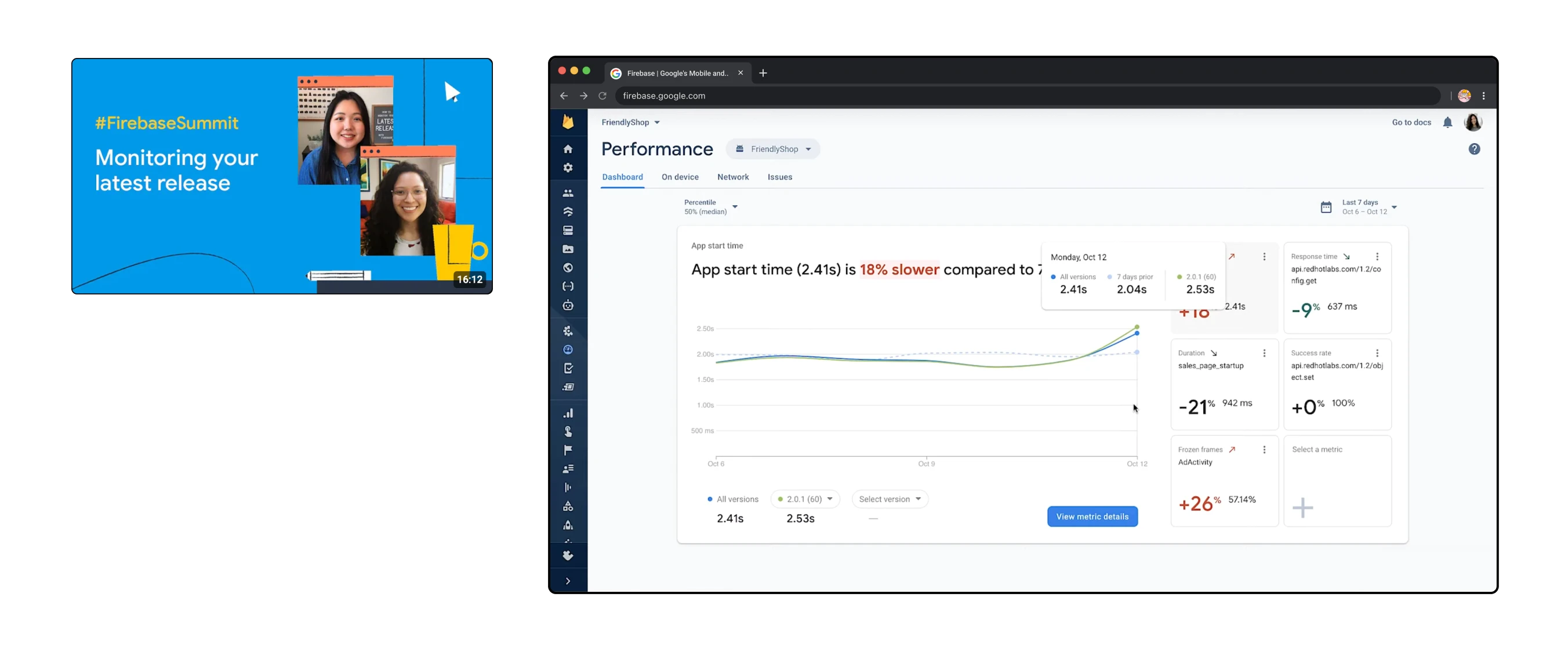
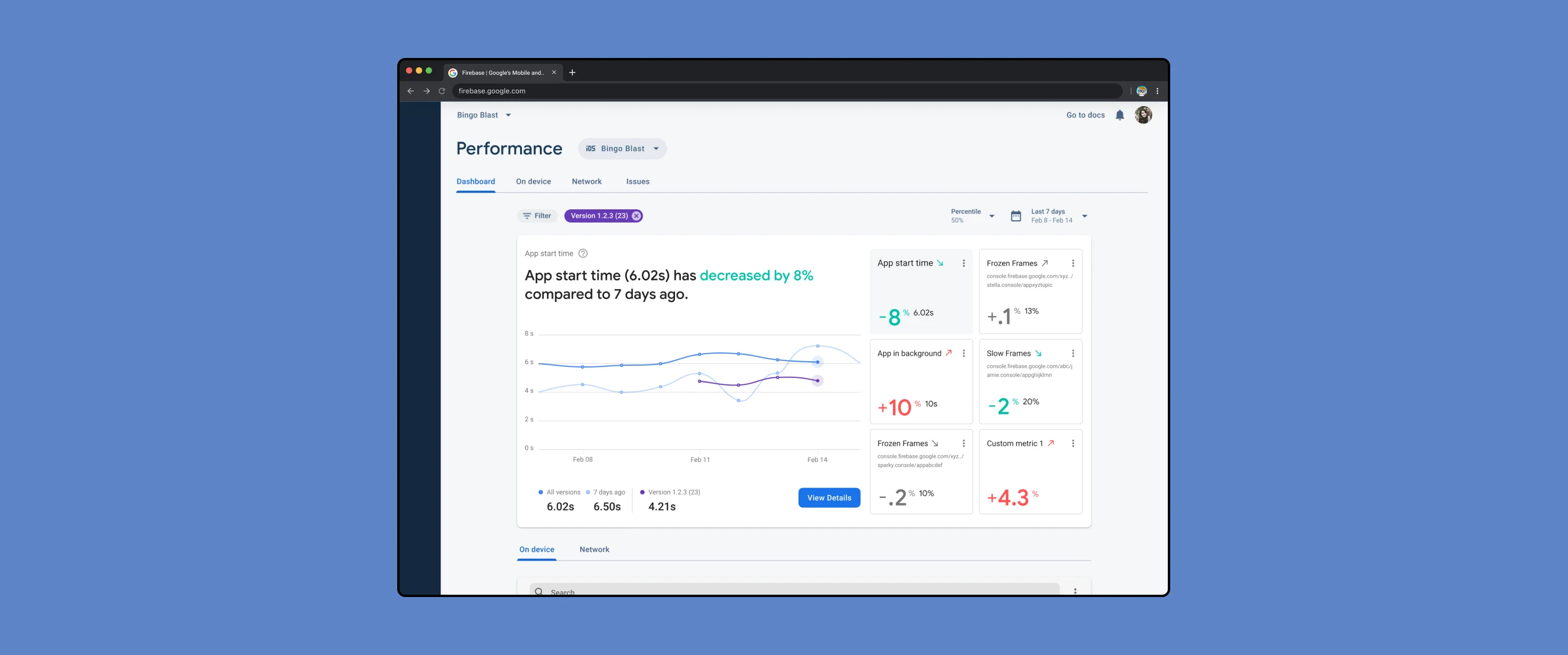
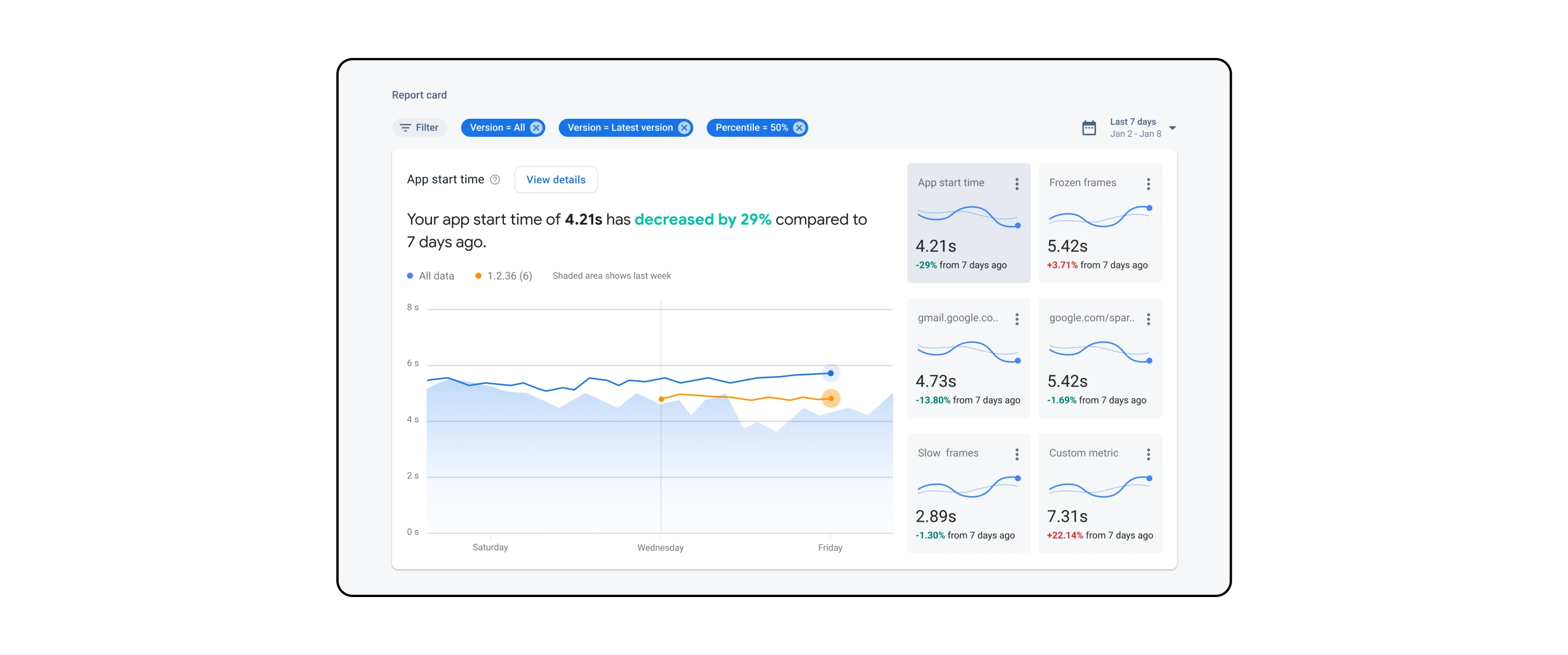
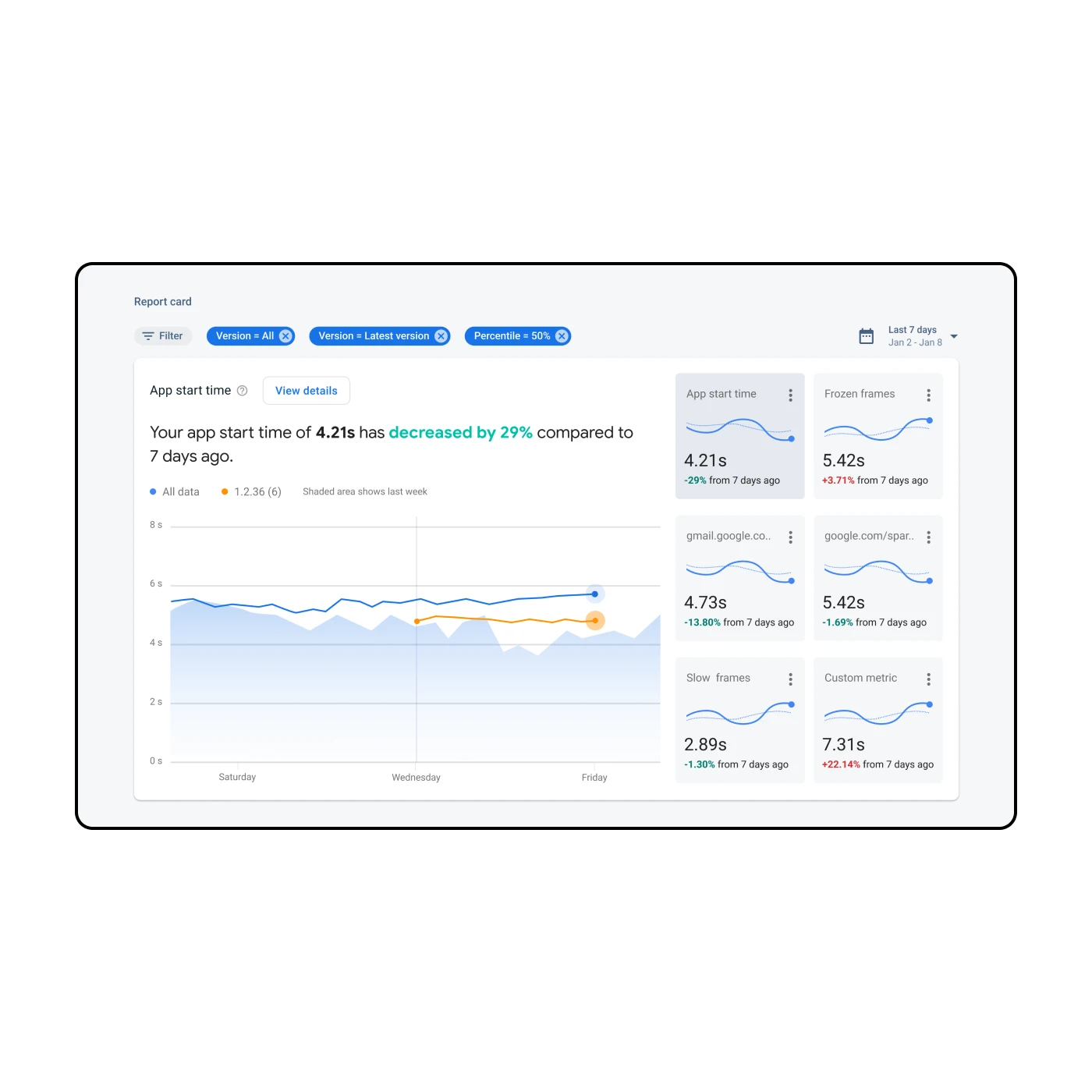
The implemented dashboard as of 2020
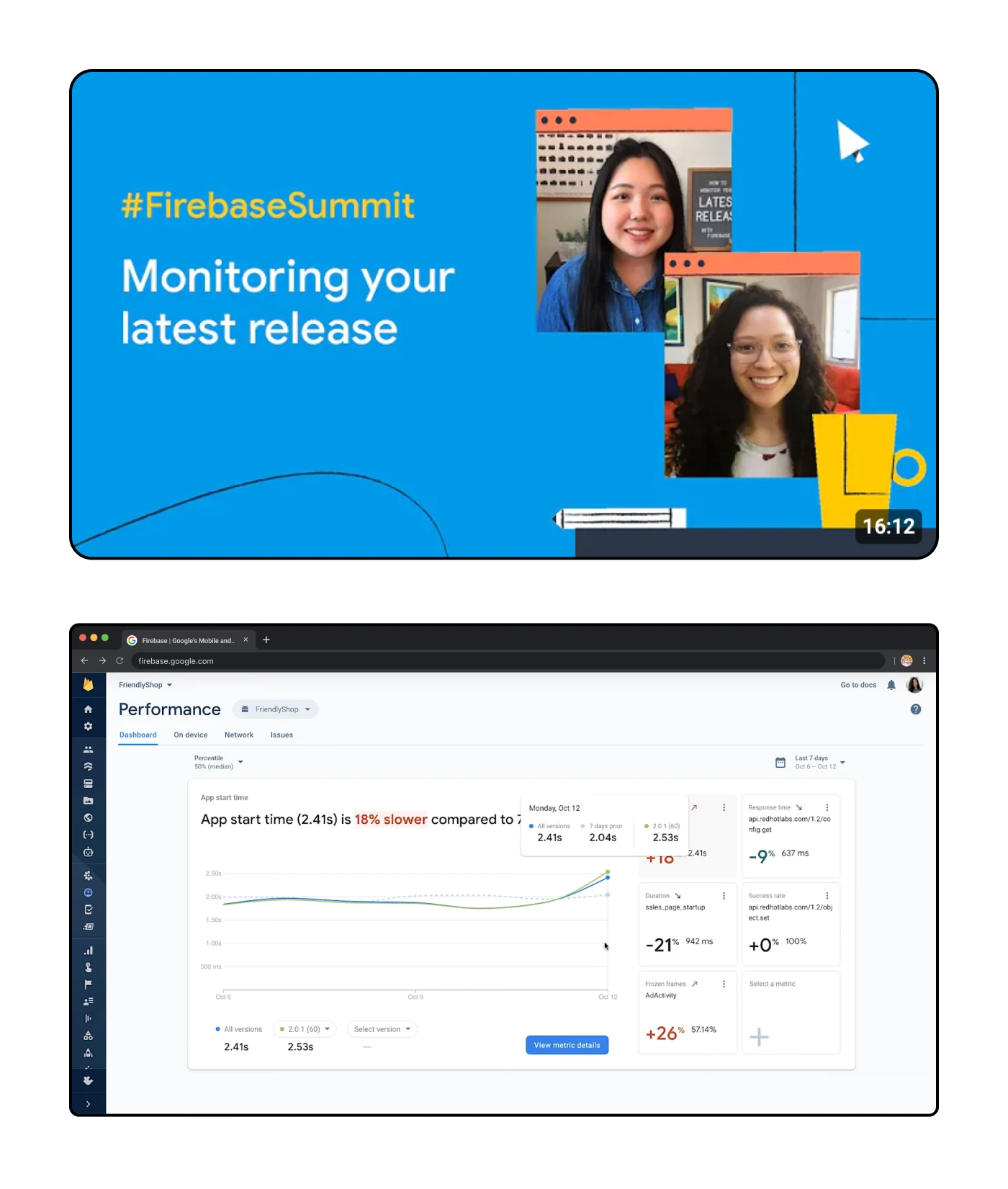
The implemented dashboard as of 2020
The dashboard launched in the spring of 2020 and was shared during the Firebase Summit for 2020. By that time I had moved on from contracting at Google but I was proud to see the new dashboard launched out into the world — especially since the implementation is so close to the initial design!
There were some noticeable changes, specifically regarding color which I think work better compared to the original designs. One design change I was unsure about was the use of background color on the high-level indication of performance and wether or not that is meant to be interactive. Otherwise, I was very pleased to see the results and be a part of Firebase.
The real-time monitoring feature is especially helpful, allowing me to see how changes to the app are affecting its performance and make necessary adjustments in real-time.
Additionally, the ability to customize and set alerts for specific performance issues is a game changer.
— Ravi
firebase user