Lead Designer ◦ 2021/2022
When I first started at Pinterest as a contractor, I sometimes would have extra bandwidth between projects. Inspired by a specific Trust & Safety use-case, I started to explore concepts for revising Pinterest's main messaging component, the Callout banner. This work quickly evolved into a system of components designed to work together as Pinterest's messaging system.
I sought feedback and advice from the Gestalt designers, my manager PJ, as well as other designers across Pinterest. Design systems have always been an interest of mine and I found inspiration in both the Gestalt design system as well as the unique problems I was observing as a designer on the Platform team.
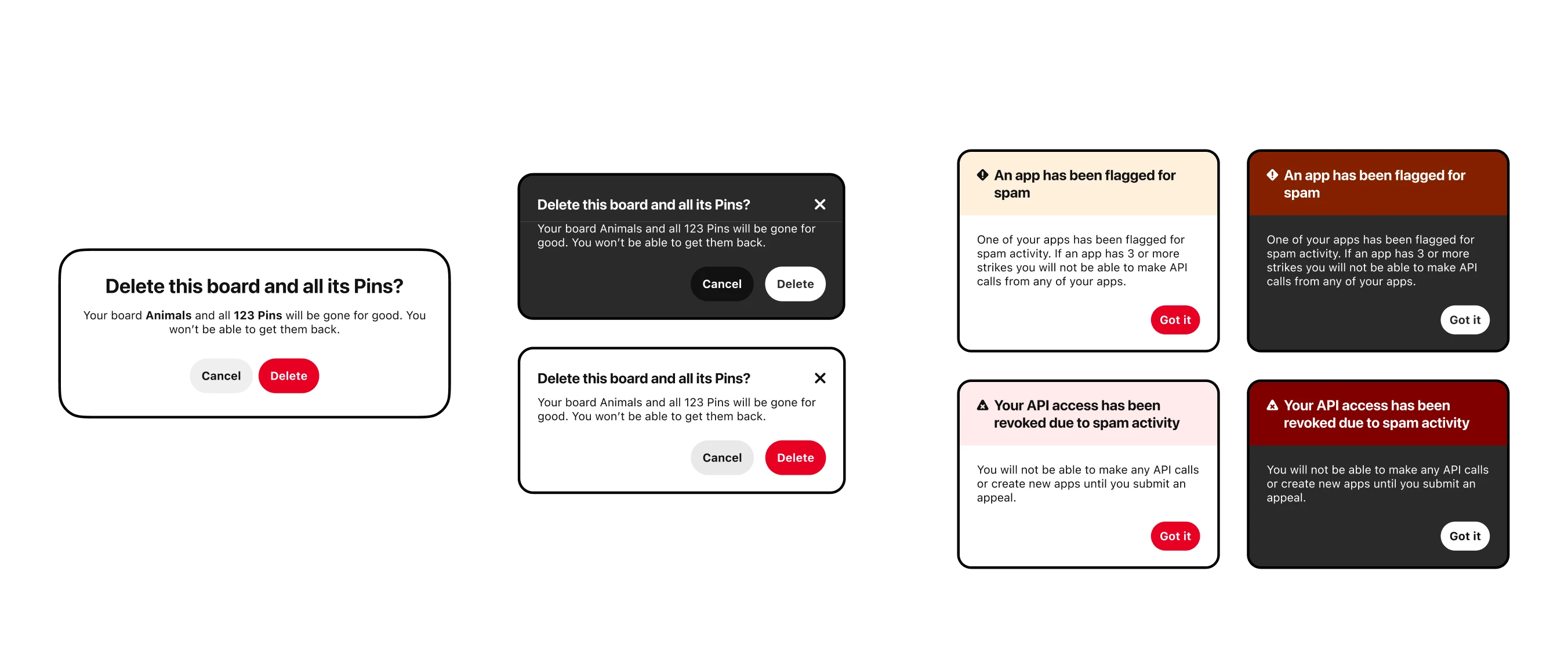
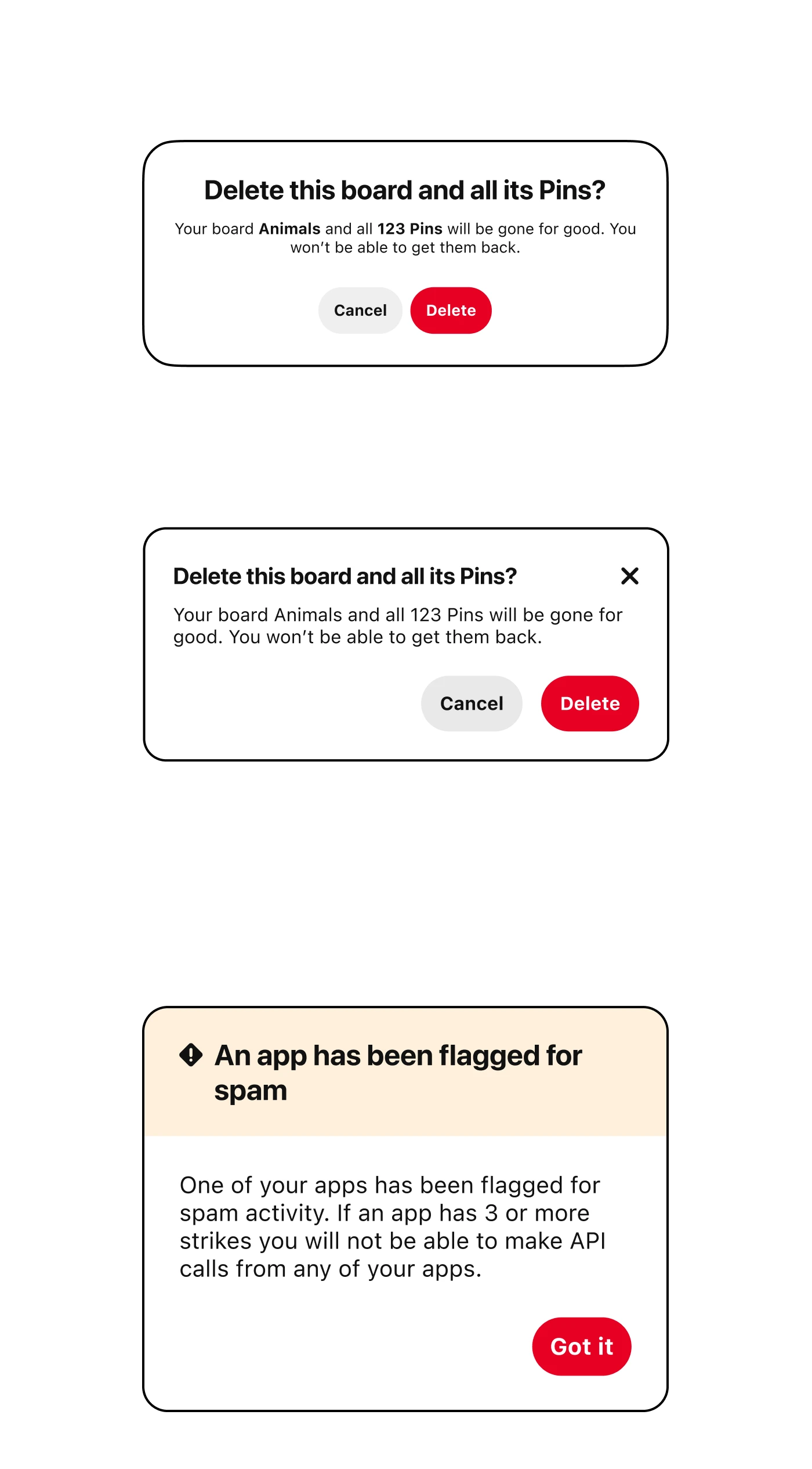
Like any social media platform, Pinterest has bad actors who spam well-meaning users with follow requests, direct messages, etc.
Like any social media platform, Pinterest has bad actors who spam well-meaning users with follow requests, direct messages, etc.
The basis for this work started with a Trust & Safety project that involved a tool called Guardian, which generates messaging when users hit spam-blocks. This may be due to bot-like actions like spamming follow requests, direct messages, and other unwanted behavior. The tool prevents further spam by temporarily blocking the user from further action.
Unfortunately the tool can’t detect what device or theme used by someone. This conflicted with how Gestalt is set up because it is split into device-specific branches of the system meant for desktop, Android and iOS versions of the Pinterest app as well as the themes of light mode and dark mode. To solve the problem in the meantime, I followed Gestalt’s suggestion and defaulted to a light mode warning Callout.
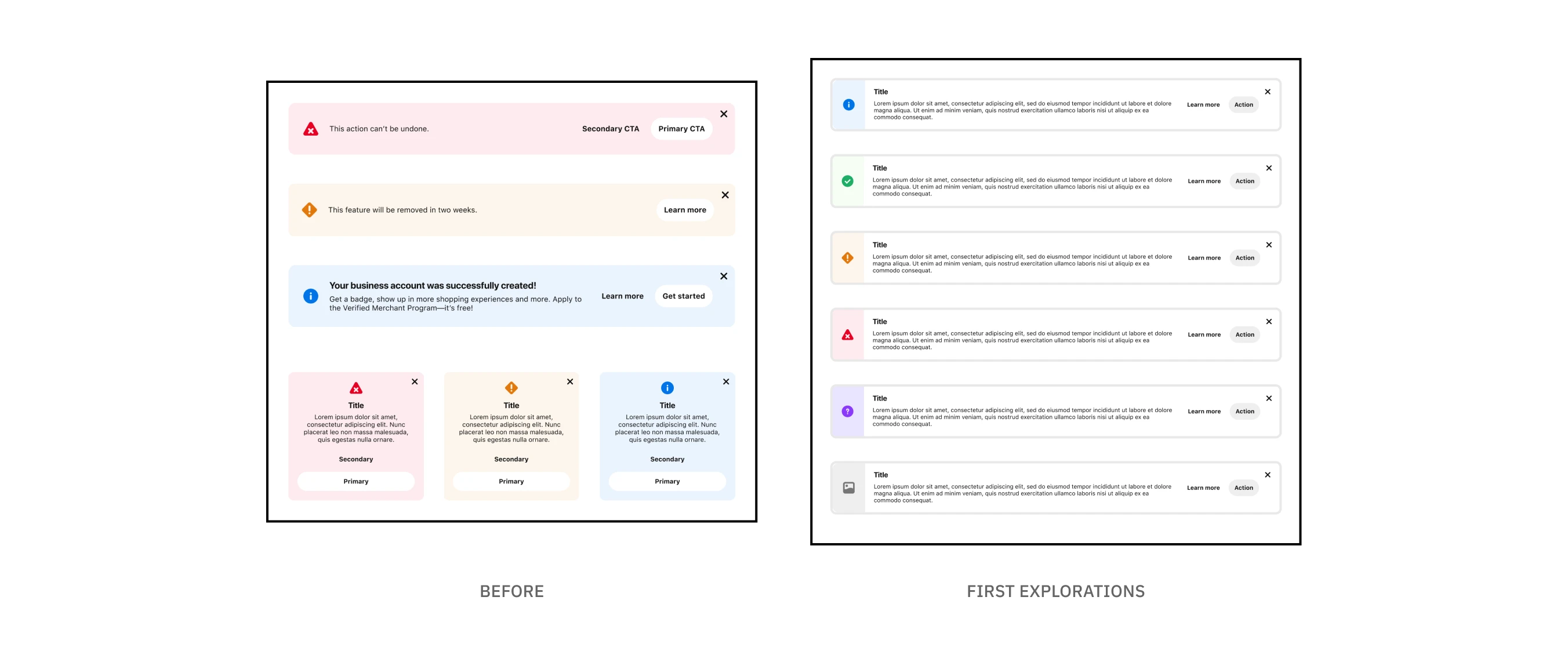
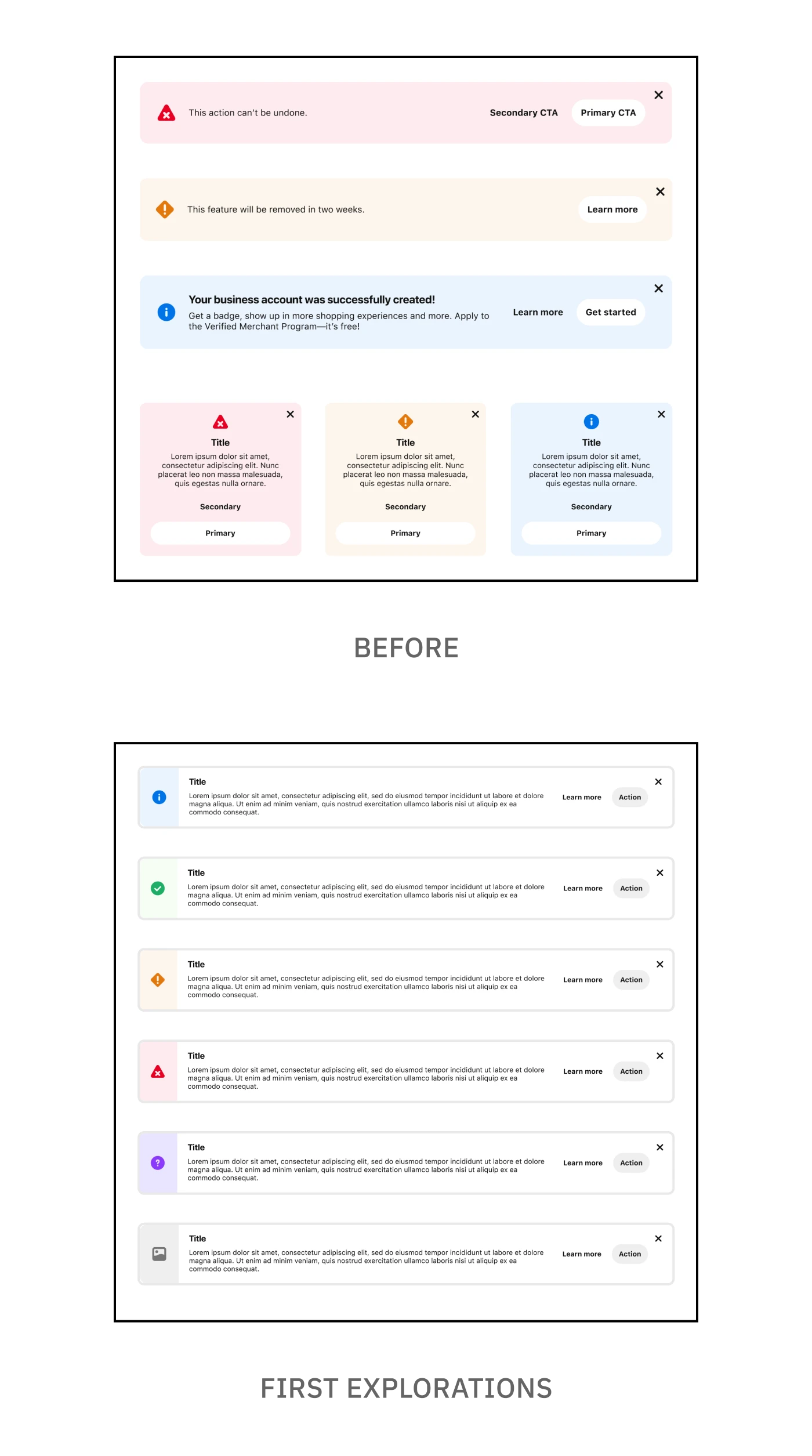
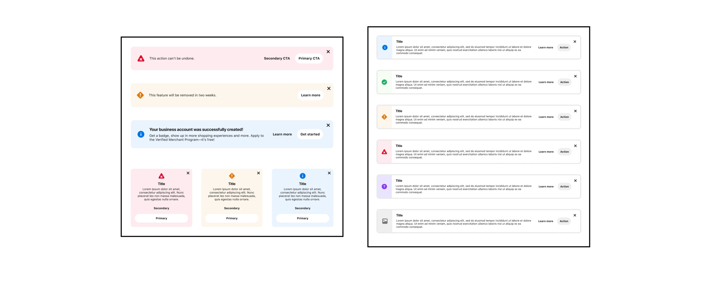
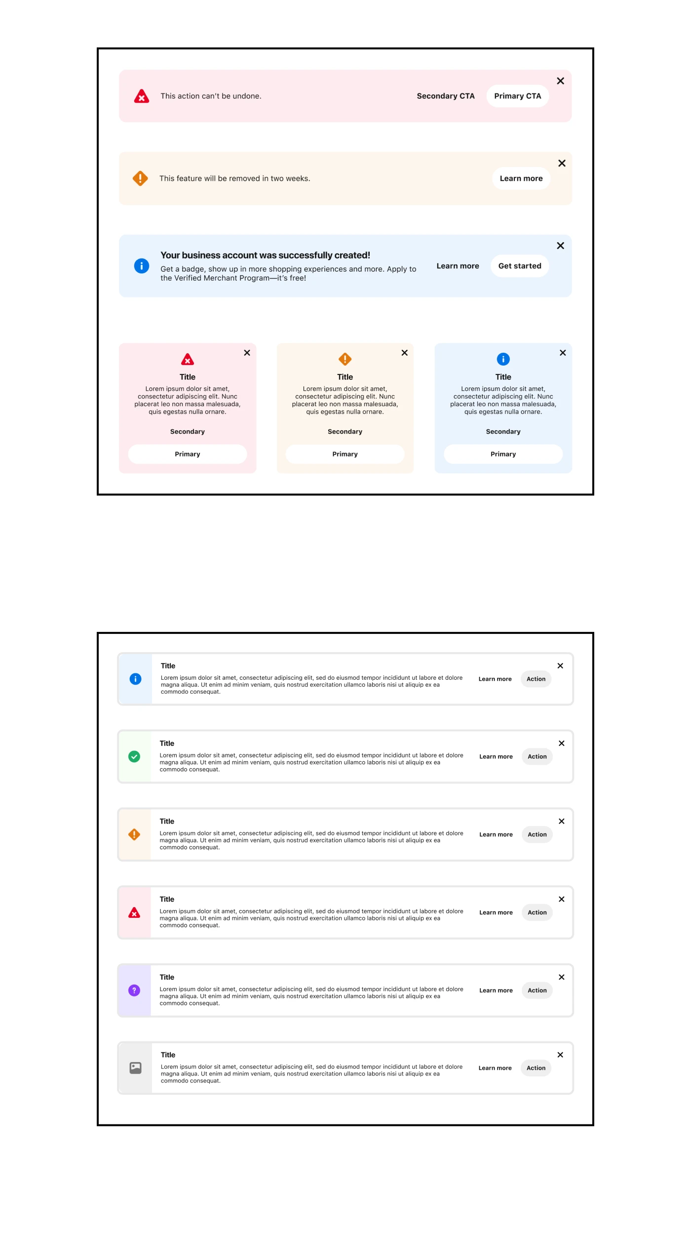
The Callout component is a versatile component used for most messaging use-cases by default. However, there’s issues with the component’s design that make it less ideal for certain situations. One issue concerned spacing and horizontal stacking which is easily broken when content goes beyond a specific length. Another issue was related to the use of color, which felt like a deviation from Pinterest’s minimalist branding.
The goal of this project was to create a comprehensive system of messaging components, both with the introduction of new components and revision of existing ones. These components would be more tailored to specific messaging scenarios rather than the current "size one fits all" approach to messaging.
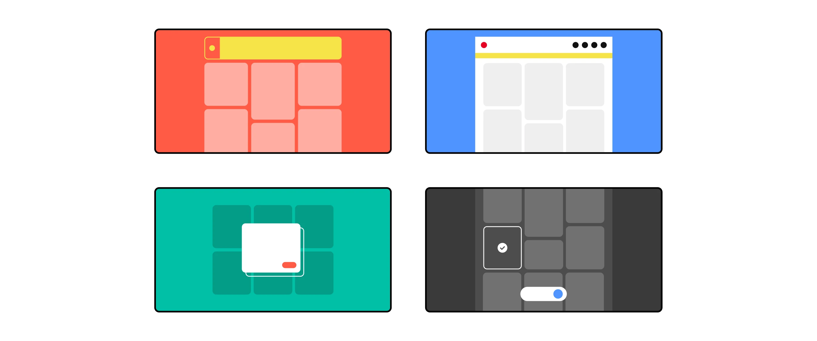
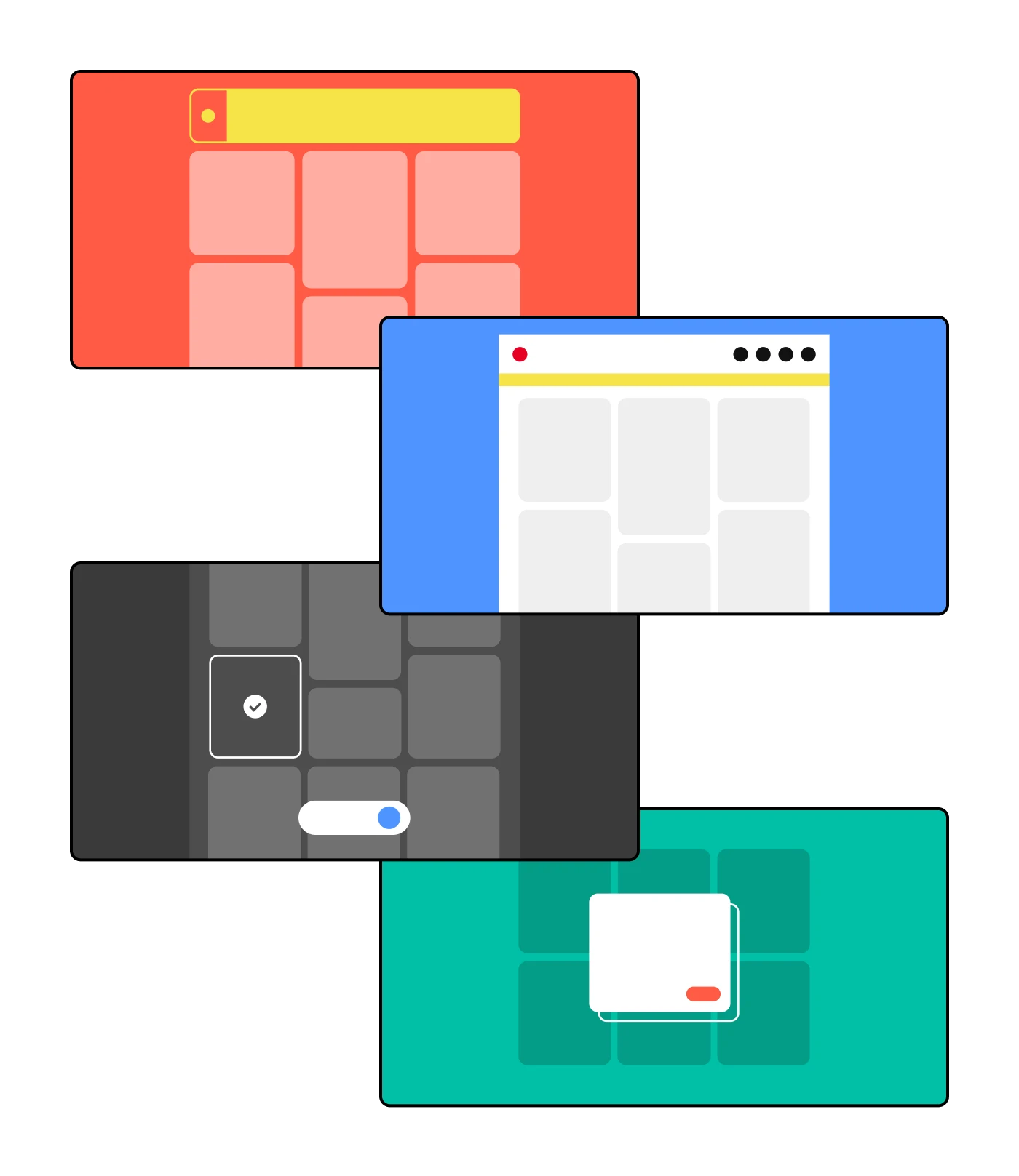
Early explorations expanding the options for sentiment variations
Early explorations expanding the options for sentiment variations
Early explorations expanding the options for sentiment variations
Early explorations expanding the options for sentiment variations
A big part of this project was exploring different design options, both to address existing concerns and to introduce new concepts. At this point in the process I wasn’t aiming for perfection but a solid concept that I could share with other designers. From there, I could further iterate based on concerns, suggestions, and other improvements.
Perhaps most important to me was designing something that could be used by the other designers at Pinterest. Creating a one-off solution might work for this specific issue with Guardian, but this project was meant to look more holistically at how messaging works across the different surfaces at Pinterest.
Illustrations using the existing style for Gestalt thumbnails in Figma
Illustrations using the existing style for Gestalt thumbnails in Figma
Documenting my thought process as I was designing helped ensure that the designs were thoroughly considered. I drafted the documentation in Coda which included information for each component: variants, interactive states, best practices and in-product examples. I also included illustrations.. because I will use any excuse to utilize my graphic design skills!
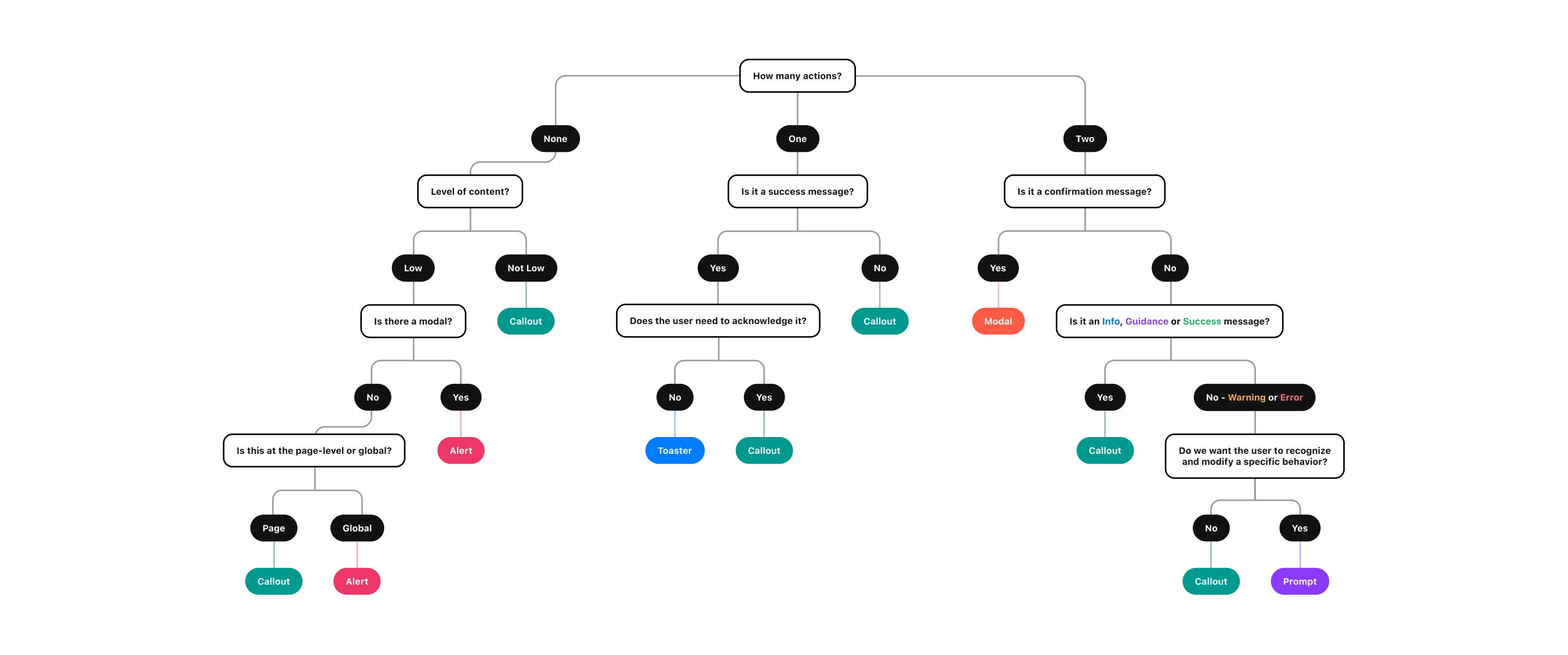
The first draft of a decision tree for helping designers choose the right component
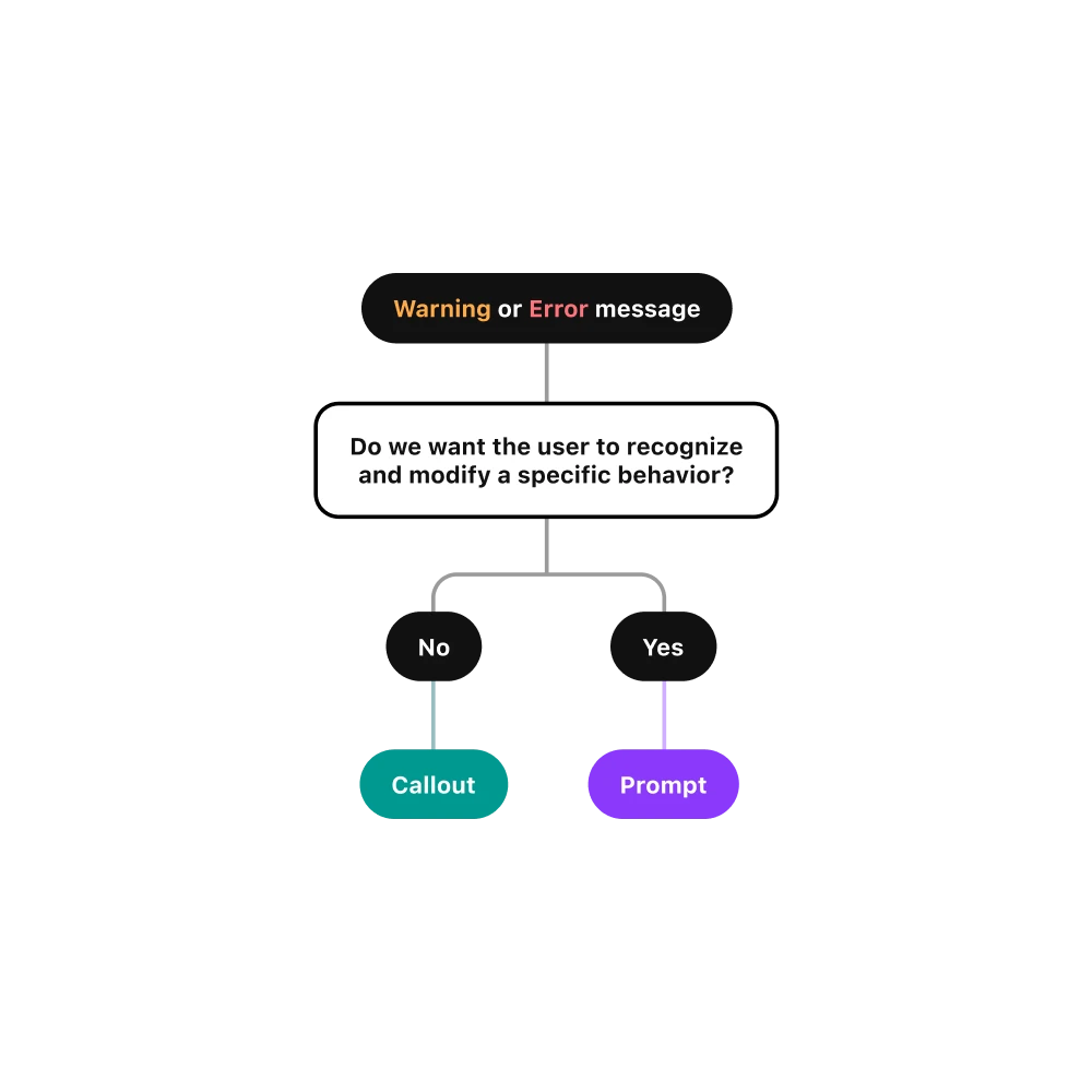
The first draft of a decision tree for helping designers choose the right component
I also started to mock-up the first iteration of a decision tree that could help someone decide which component to use. This would evolve over time as I continued to iterate on the mocks. By providing multiple resources, we can account for the different ways designers utilize information in their designs. For example, someone who prefers to read into the nitty gritty details compared to someone who prefers visual guidance.
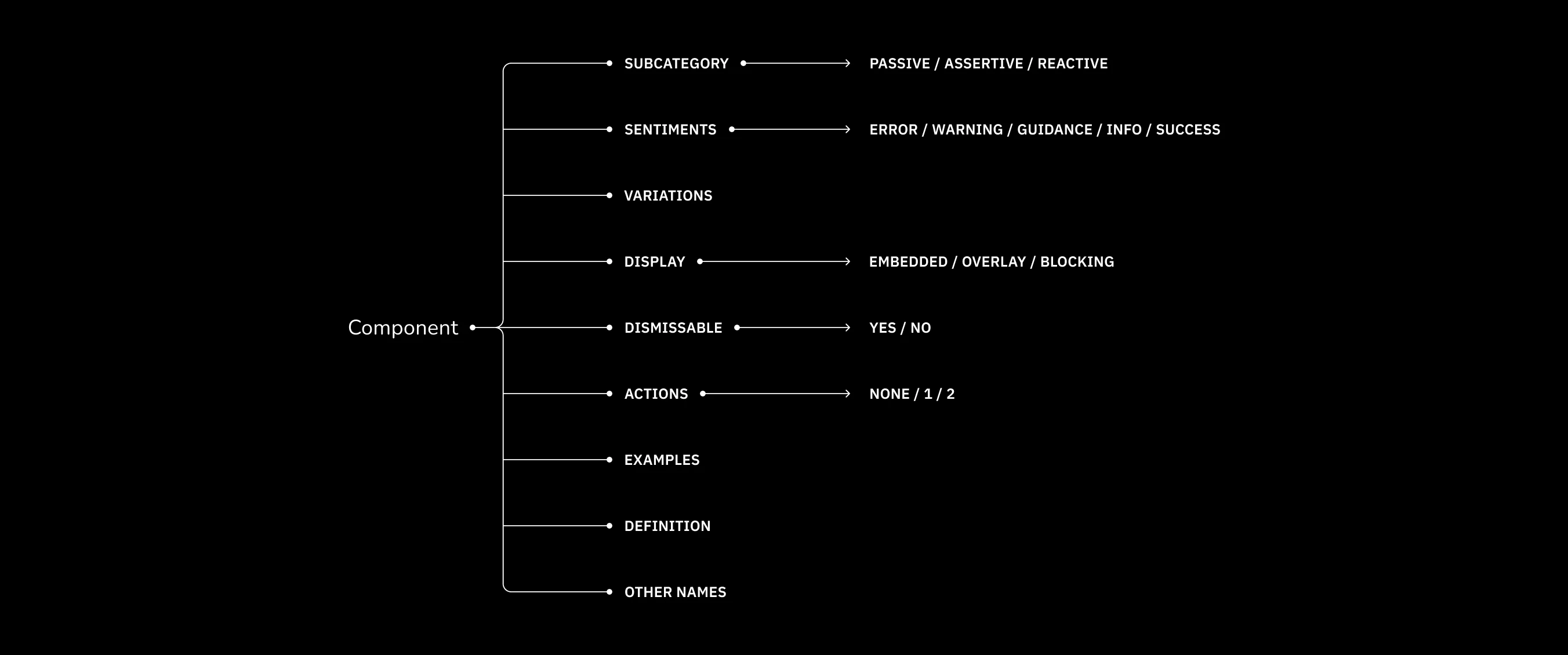
Defining the different aspects of each component helped me understand where there was overlap and potential confusion
Defining the different aspects of each component helped me understand where there was overlap and potential confusion
Defining the different aspects of each component helped me understand where there was overlap and potential confusion

Defining the different aspects of each component helped me understand where there was overlap and potential confusion
The more I dove into this project, the more ideas I had to improve existing components other than just the Callout — specifically Modals and Toasts. This was at the same time I was introducing new concepts in the form of Prompts, a "mini" version of Callouts, and standardizing Empty States.
I realized I needed to take a step back and formally define each component to ensure there weren't any redundancies, to understand potential overlap and to identify possible sources of confusion.
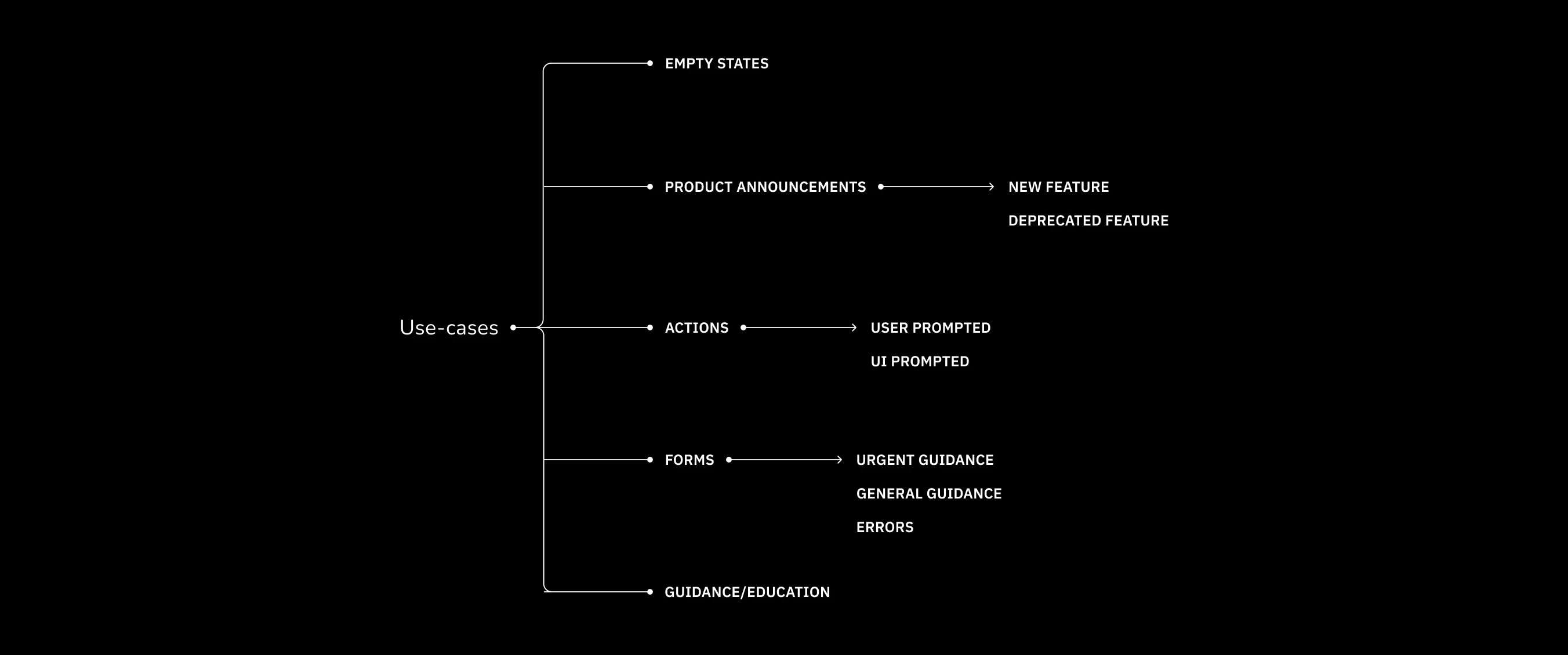
I categorized messaging as follows: empty states, product announcements, action-related, form-related, and user guidance

I categorized messaging as follows: empty states, product announcements, action-related, form-related, and user guidance
I categorized messaging as follows: empty states, product announcements, action-related, form-related, and user guidance
I categorized messaging as follows: empty states, product announcements, action-related, form-related, and user guidance
I utilized different avenues for research in order to better understand the actual problems designers were solving. One avenue was the Gestalt Slack channel. I looked for messaging projects spanning the last 3 months to understand what problems designers were solving, what the Gestalt recommendation was, and how that designer ultimately utilized established components and patterns to devise a solution.
From there, I organized these projects into the following categories:
For a design system contribution to be effective, it needs to be grounded in solving actual problems.. And there are plenty of messaging-related problems to go around!
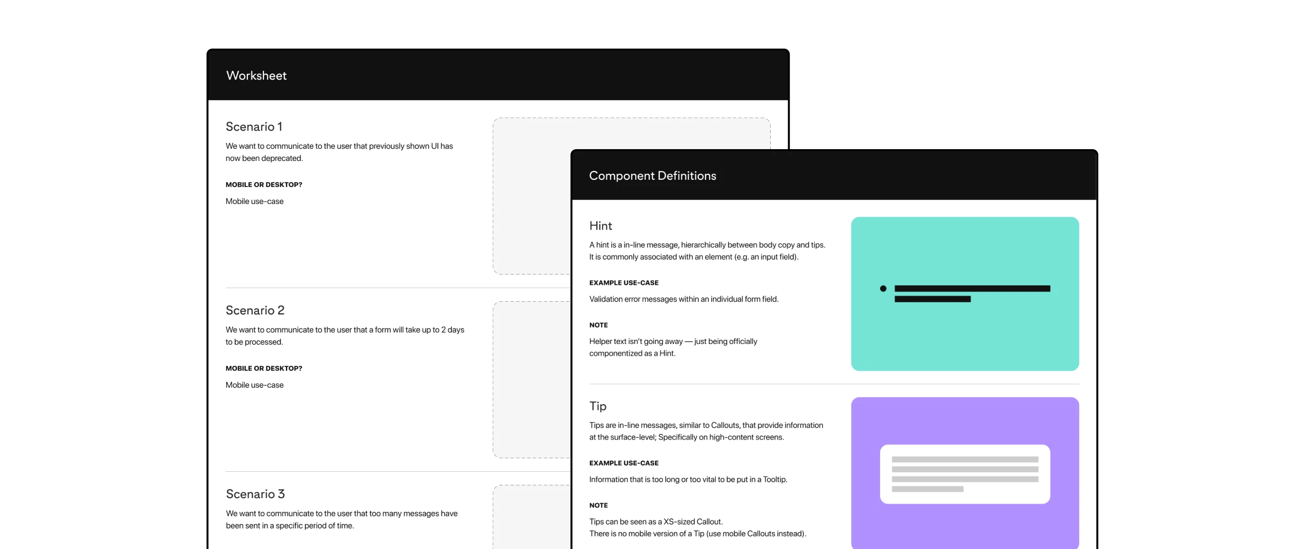
Each research participant was given component definitions and a list of scenarios in which they would select a specific component
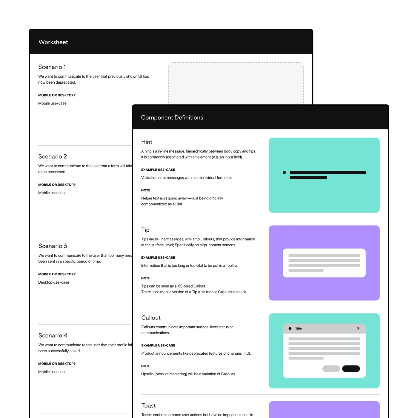
Each research participant was given component definitions and a list of scenarios in which they would select a specific component
I identified individuals for each of Pinterest's main UX pillars: consumer, monetization, and the platform team. I knew I couldn't test with everyone, so I wanted to test with designers who could represent that surface's specific interests and goals. This included someone from my own team who had been on the team longer than I had.
I walked each person through the different forms of documentation (component definitions and updated decision tree) and had each person choose a component for various scenarios. I wanted to see how 1) someone would go about making the choice for a given scenario and 2) how their chosen components aligned. This helped identify potential gaps in documentation or in the components themselves.
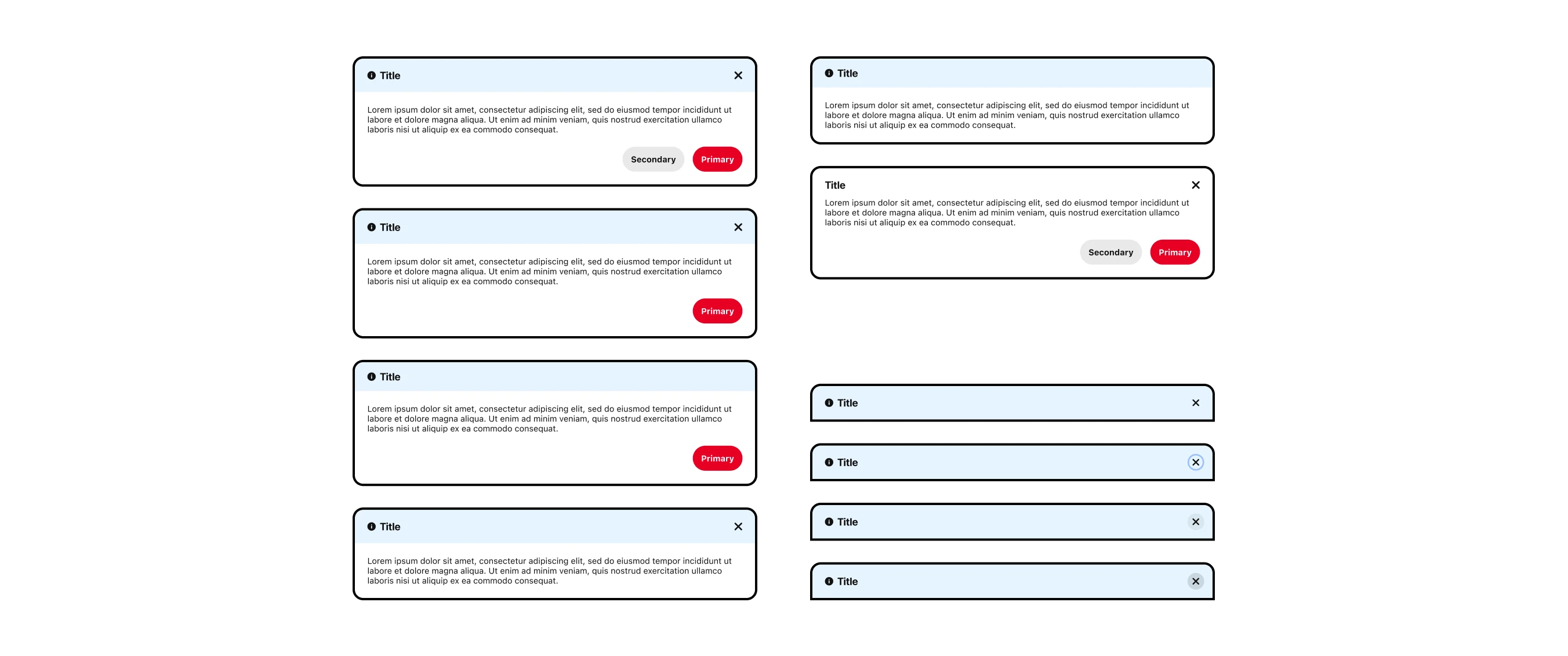
The revised Callout included variations for flexibility across different use-cases, which then required the proper documentation to be universally understood
The revised Callout included variations for flexibility across different use-cases, which then required the proper documentation to be universally understood
Transitioning from a contract role to a full-time role meant handing off this work to the Gestalt team officially so I finalized the design specs in Figma and put together written documentation for the Gestalt website. I worked with one of the Gestalt designers, Hector, to understand the props needed for each component. I also included other information including the "do's and don'ts" which is listed for component. I had drafted this early on with the Coda documentation.
I took some inspiration from Material's guidelines for redlining mocks for engineering and identifying the different aspects of each component. There was a lot of detailed thinking that went into these components and I wanted to make sure that was clearly documented.
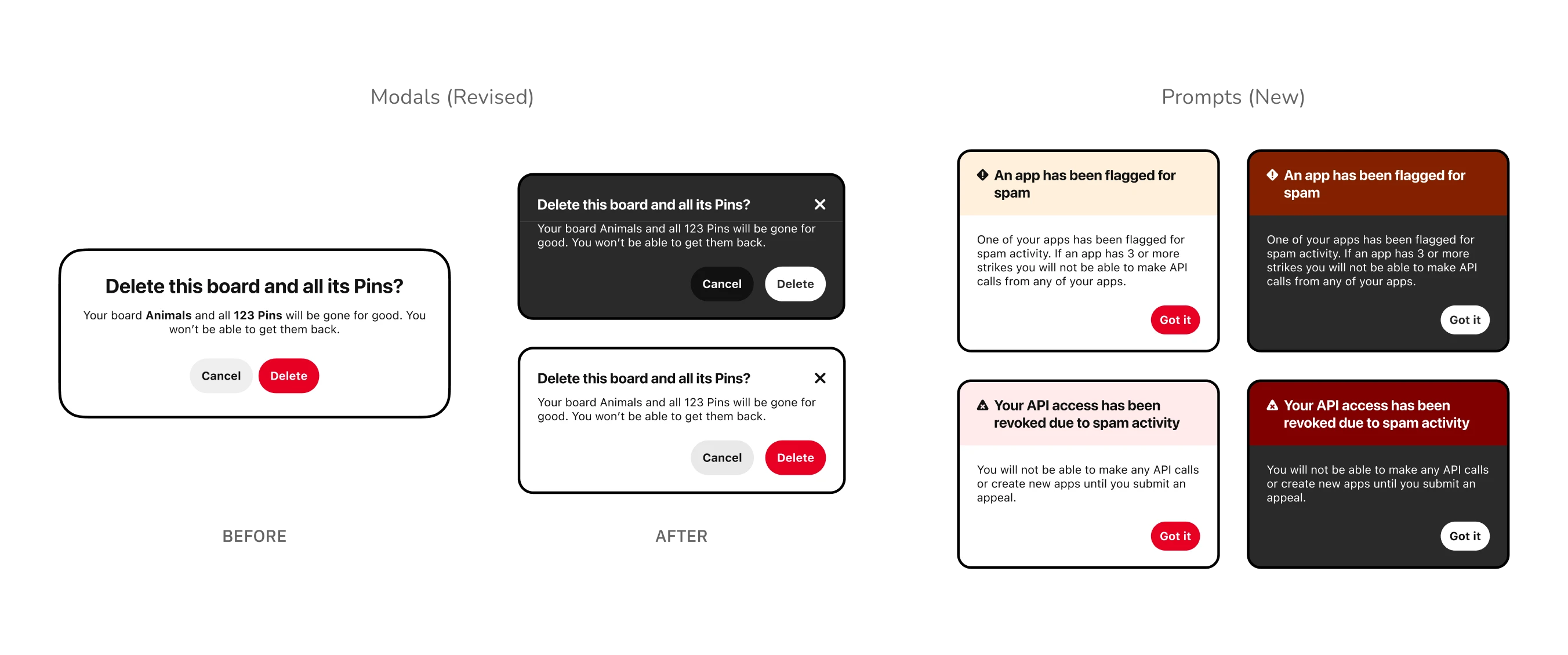
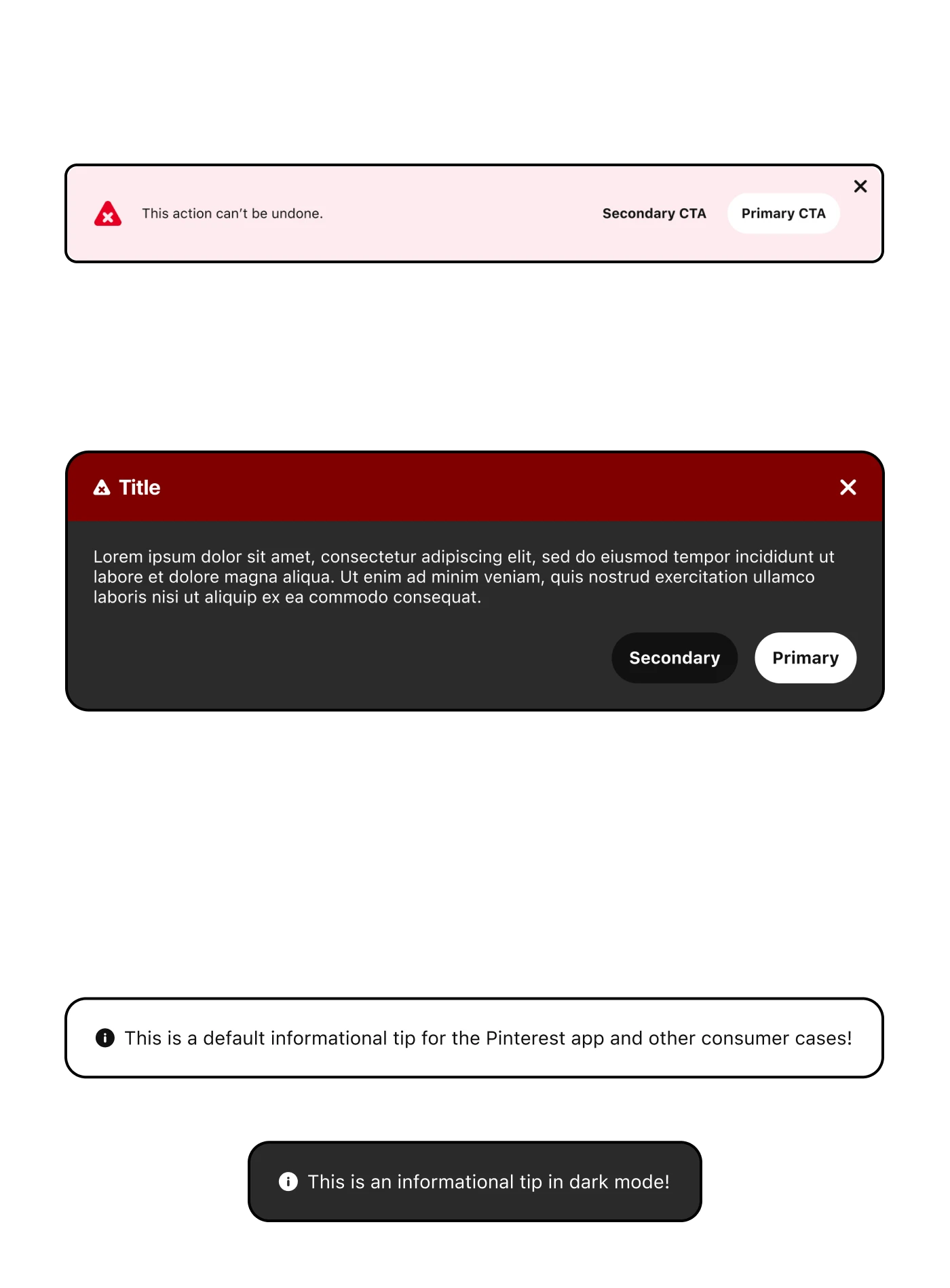
Left: The "Before" and "After" for the Modal component
Right: The "final" Prompt component inspired by the Guardian use-case
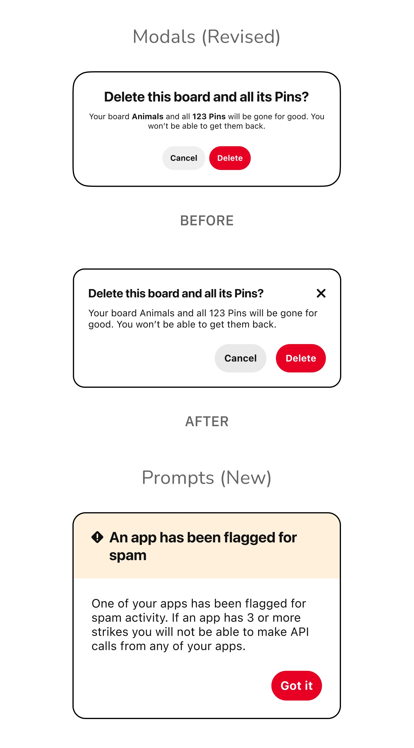
Top: The "Before" and "After" for the Modal component
Bottom: The "final" Prompt component inspired by the Guardian use-case
Left: The "Before" and "After" for the Modal component
Right: The "final" Prompt component inspired by the Guardian use-case
Top: The "Before" and "After" for the Modal component
Bottom: The "final" Prompt component inspired by the Guardian use-case
The final hand-off included the following components:
Other components that were de-prioritized included:
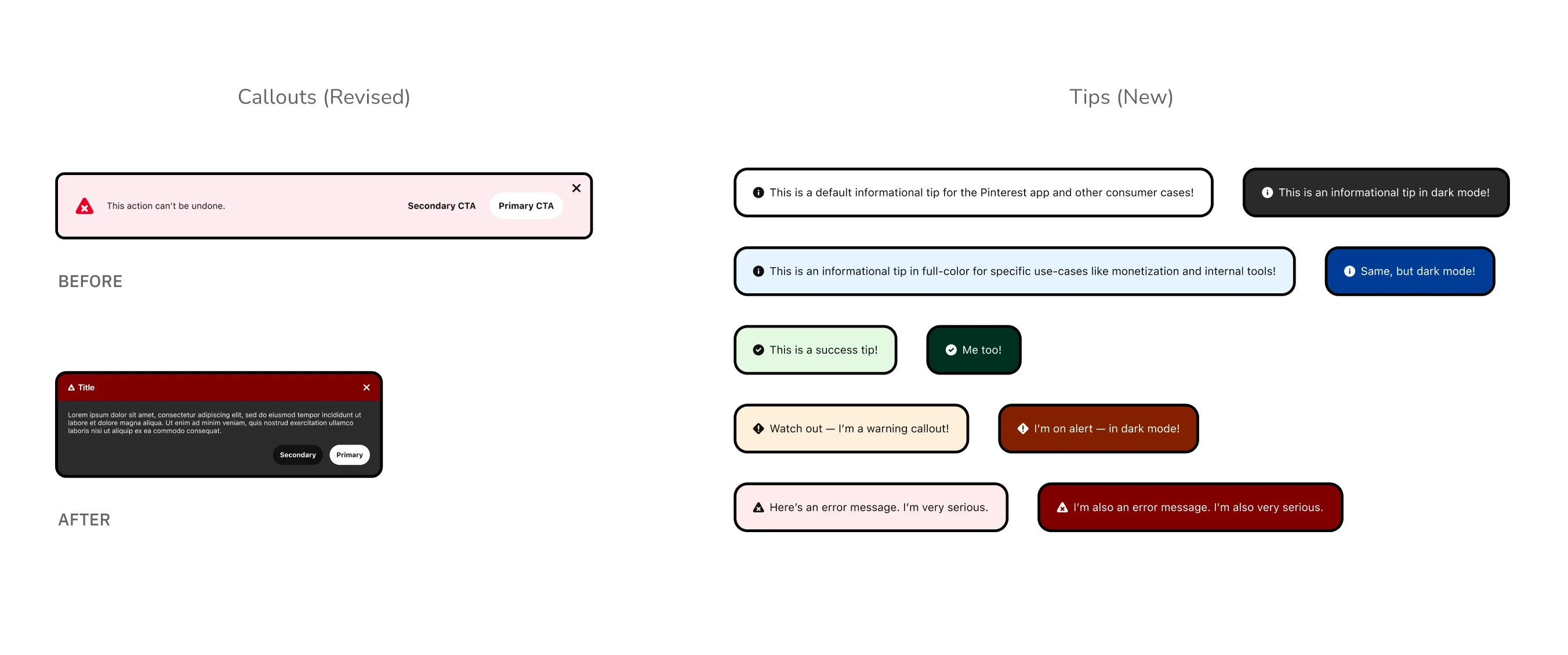
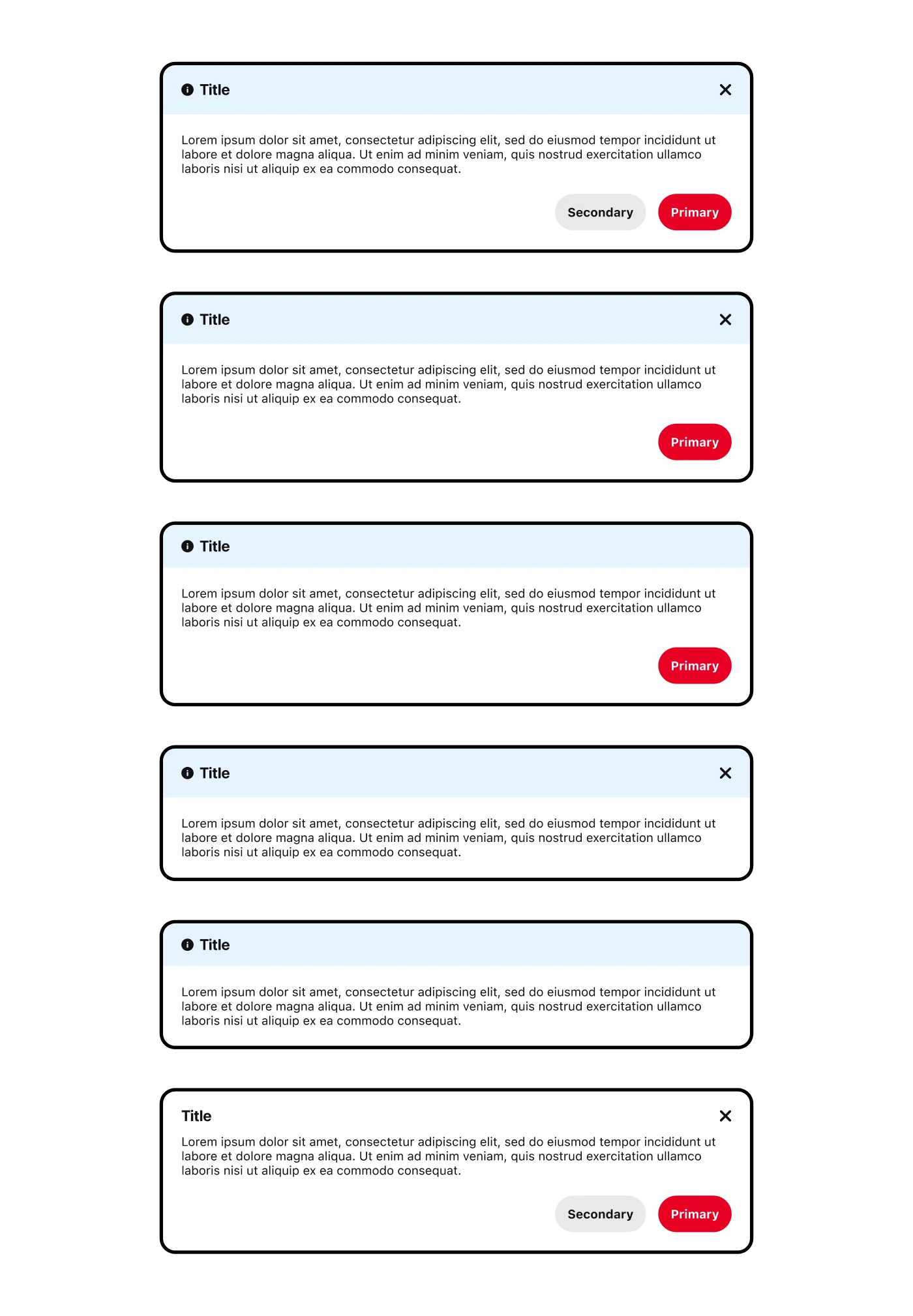
Left: The "Before" and "After" for the Callout component
Right: The final Tips, a smaller form of Callouts for condensed messages
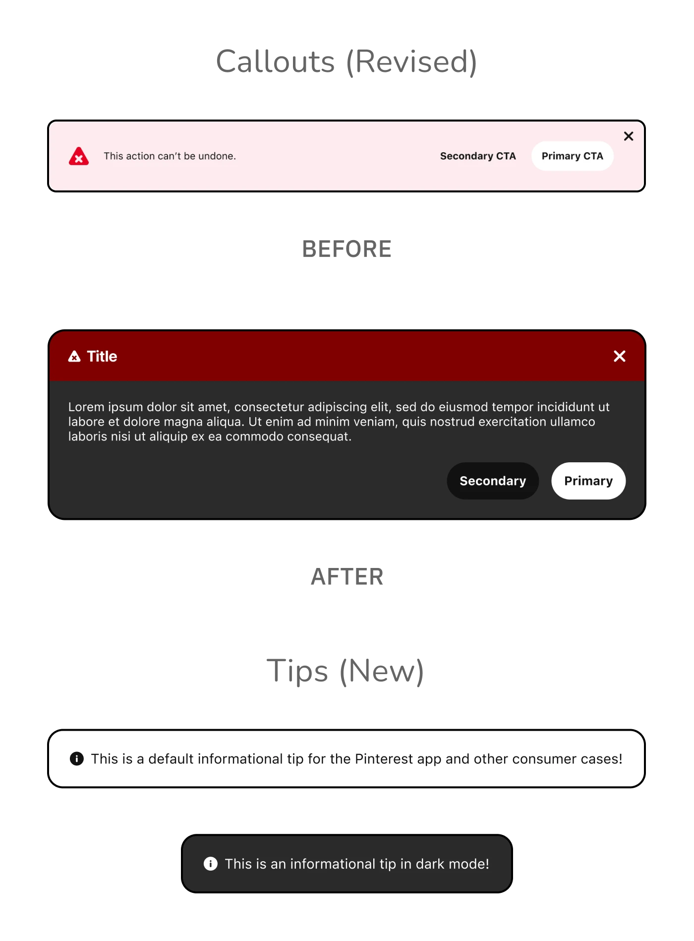
Top: The "Before" and "After" for the Callout component
Bottom: The final Tips, a smaller form of Callouts for condensed messages
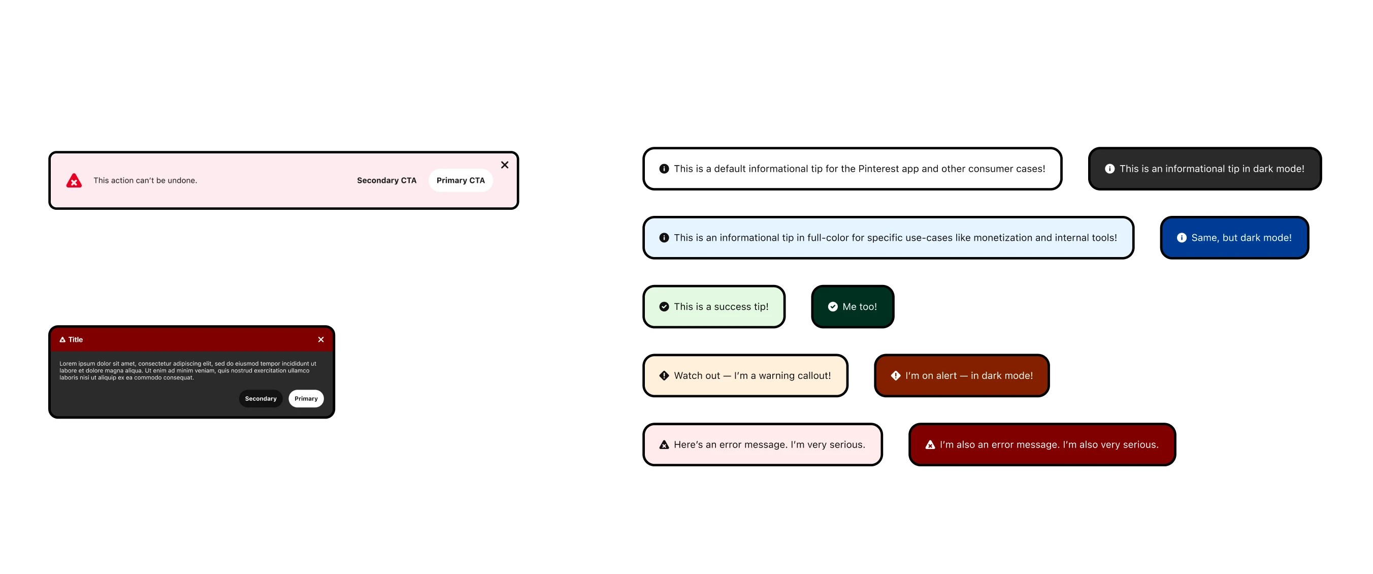
Left: The "Before" and "After" for the Callout component
Right: The final Tips, a smaller form of Callouts for condensed messages
Top: The "Before" and "After" for the Callout component
Bottom: The final Tips, a smaller form of Callouts for condensed messages
At the time, the Gestalt was still relatively small and there simply was not enough resources to do everything the team planned. As such, much of this work was re-prioritized after I handed off the designs and moved onto another team and began to focus on other projects.
To be honest, it was disappointing given the amount of time and effort spent on this work. I was confident these designs provided objective improvements and felt like the overall issue of lack of flexibility in the system had not yet been meaningfully addressed. However, this work was the impetus for considering messaging as a foundational part of the design system. An example of this newfound commitment was demonstrated in the addition of a new section on the Gestalt website.
The (previously) public Gestalt website with a special section for Messaging patterns
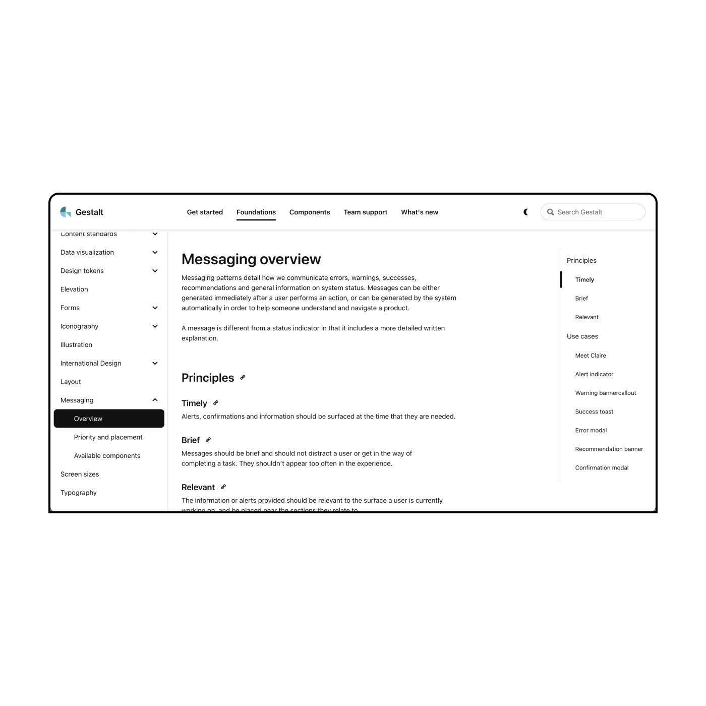
The (previously) public Gestalt website with a special section for Messaging patterns
Gestalt has continued to change and evolve beyond my time at Pinterest. As of late 2025, Pinterest has decided to no longer update the publically available Gestalt website.
Being a good designer often means identifying problems and solutions outside your specific niche. When it comes to larger systematic change, however, there's only so much one person can accomplish. I attempted to bypass any limitations by involving collaborators at each step in the process.. But in the end, there was just too many competing priorities for a small team to contend with.
When people think of Pinterest they typically think of the "Pinner" experience, but there's also business users and internal users behind the scenes. A design system that caters to all these different types of people requires robust frameworks and flexible, customizable components. It also requires more designers and engineers to tackle the neverending roadmap of requests.
Jamie is a natural systems thinker and was as strong as collaborator with the Gestalt design system team as one could ever hope for. Jamie consistently displayed strong critical thinking and a real ability to synethsize feedback and apply it productively.
Of note, Jamie was a major part of the Gestalt team's effort to define our family of Messaging components. This was not easy work and she put in the blood, sweat and tears to get this effort off the ground. I couldn't recommend Jamie more for a product design role or a design systems role.
— PJ Onori
former manager at pinterest