Lead Designer ◦ 2019
The Publisher Center is a tool for publishing content to Google News. It allows publishers the ability to customize how their content is distributed, presented, organized and monetized on the platform. At the time, I was the lead and only designer for the Publisher Center tool. I worked with my cross-functional team to redesign it in it's entirety — screen by screen — leveraging design feedback from the Google News and Material design system designers along the way.
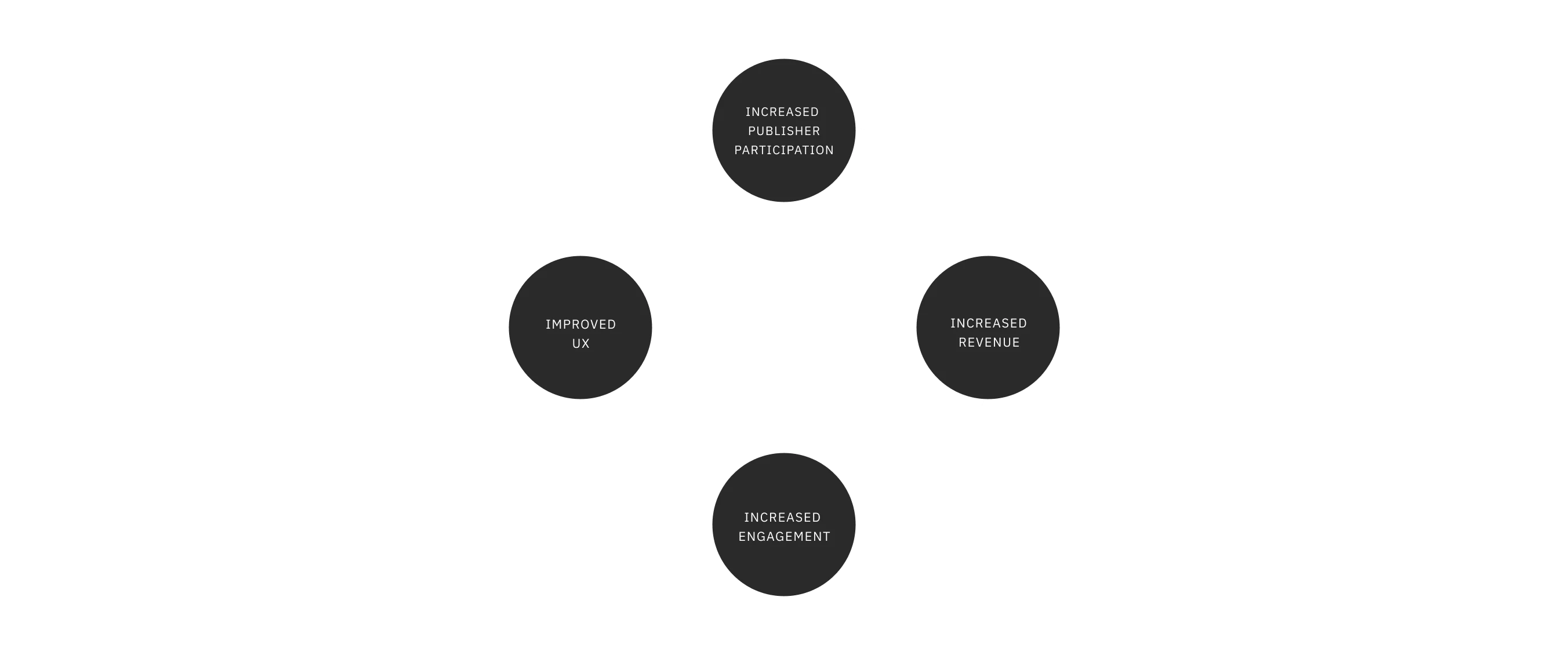
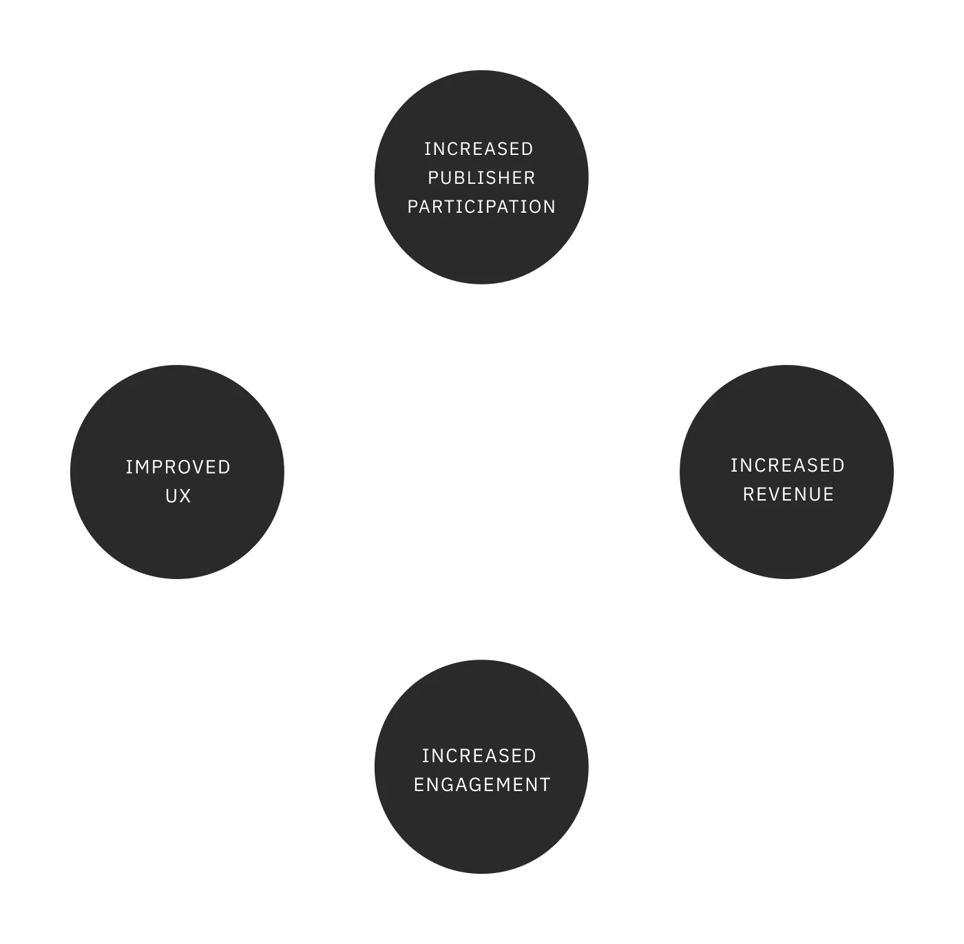
The hypotheis for this work was that improved UX would result in increased revenue and engagement from both publishers and Google users
The hypotheis for this work was that improved UX would result in increased revenue and engagement from both publishers and Google users
The hypotheis for this work was that improved UX would result in increased revenue and engagement from both publishers and Google users
The hypotheis for this work was that improved UX would result in increased revenue and engagement from both publishers and Google users
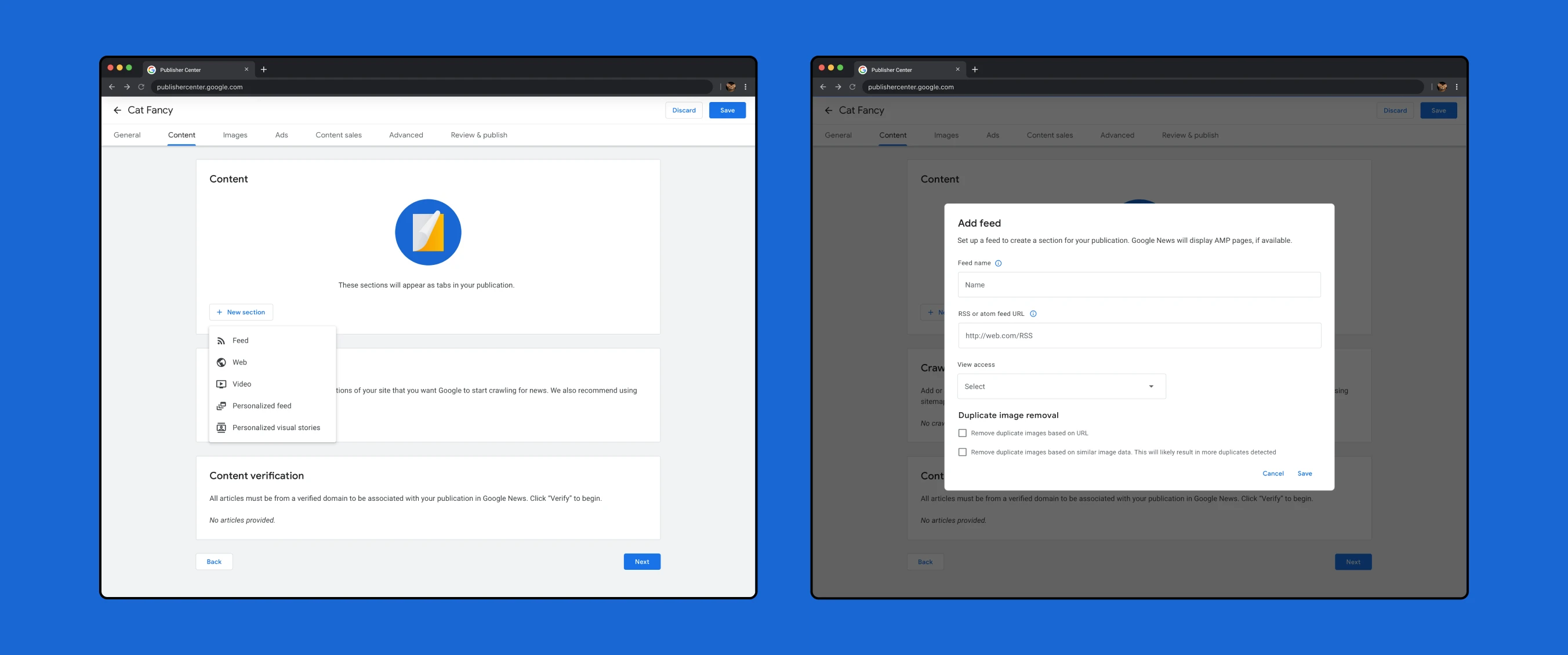
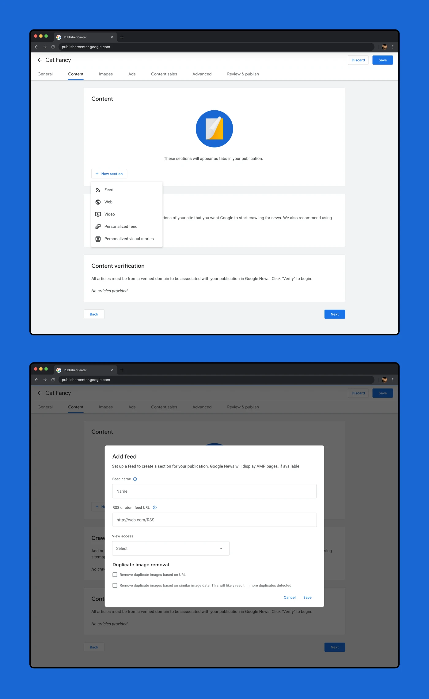
Before the redesign, the Publisher Center was a set of multiple fragmented tools that were outdated both in terms of user interface and user experience. In addition, using the Publisher Center used to require the assistance of SPMs (Strategic Partner Managers) and other internal Google employees. These issues created problems for publishers who require more flexibility in the creation, editing and management of their publications.
I joined the Google News team at a specific time in which the tech stack these tools were built on was being deprecated. The team had a set timeline to migrate the functionality and ensure continuous access.
The goal of this project was to consolidate multiple tools to create a singular, holistic platform that is accessible and user-friendly enough for publishers to use themselves. This would be done in accordance with the engineering timeline and with the support of the cross-functional Publisher Center team.
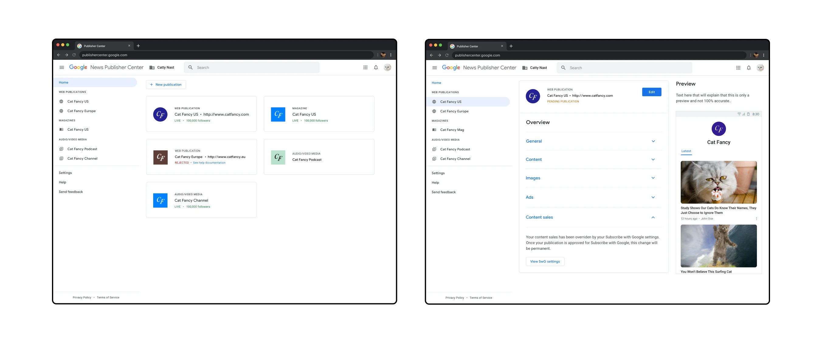
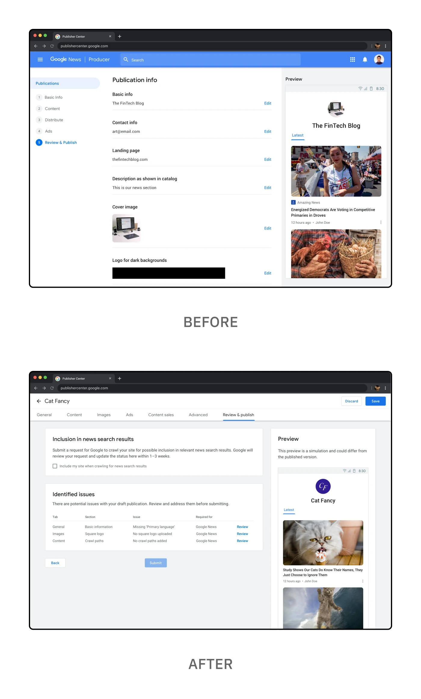
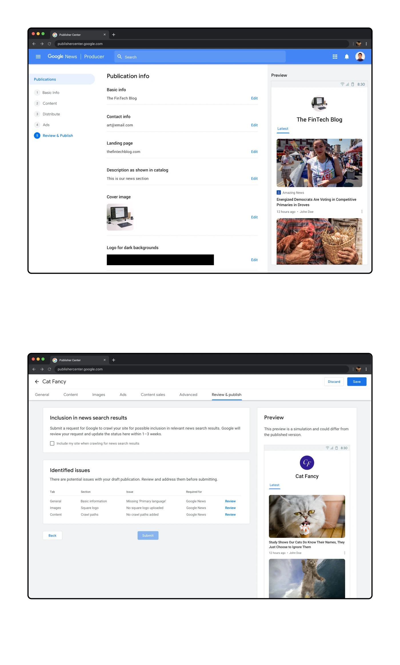
Left: The landing page for Publisher Center showing multiple publications
Right: The overview page for a specific publication
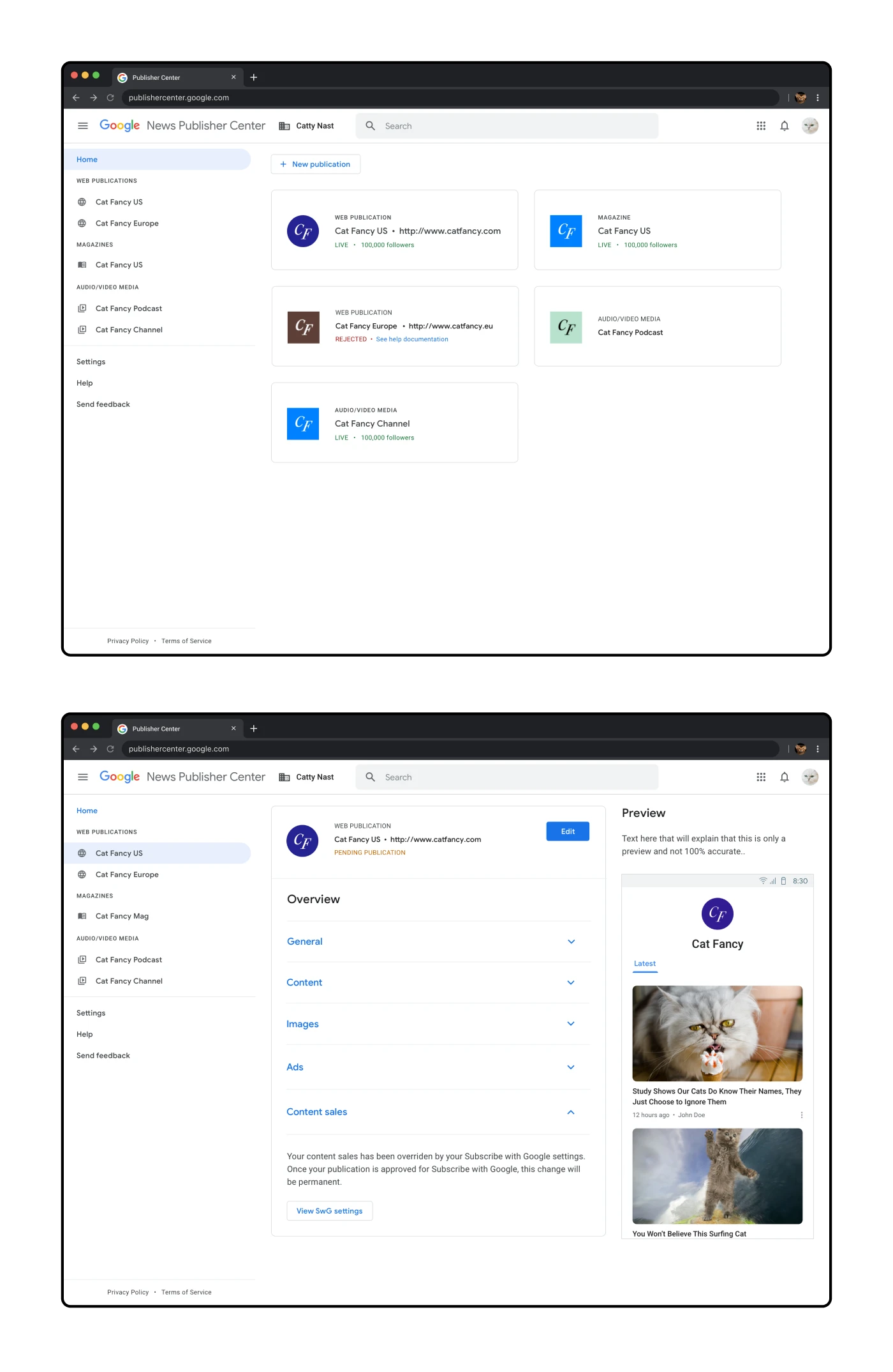
Top: The landing page for Publisher Center showing multiple publications
Bottom: The overview page for a specific publication
For the redesign, I wanted to utilize the look-and-feel of existing Google applications to ensure that the Publisher Center felt consistent with other Google experiences. The Material design system was more descriptive in terms of components rather than patterns, so I would study other tools in the Google ecosystem to better understand what was possible.
I wanted to make it more obvious how this page would scale from one publication to multiple publications. Most PC users would just have a single publication, but then there would be larger news organizations with up to 50 publications. Another example of future-thinking was the revised sidebar and consideration of future publication types.
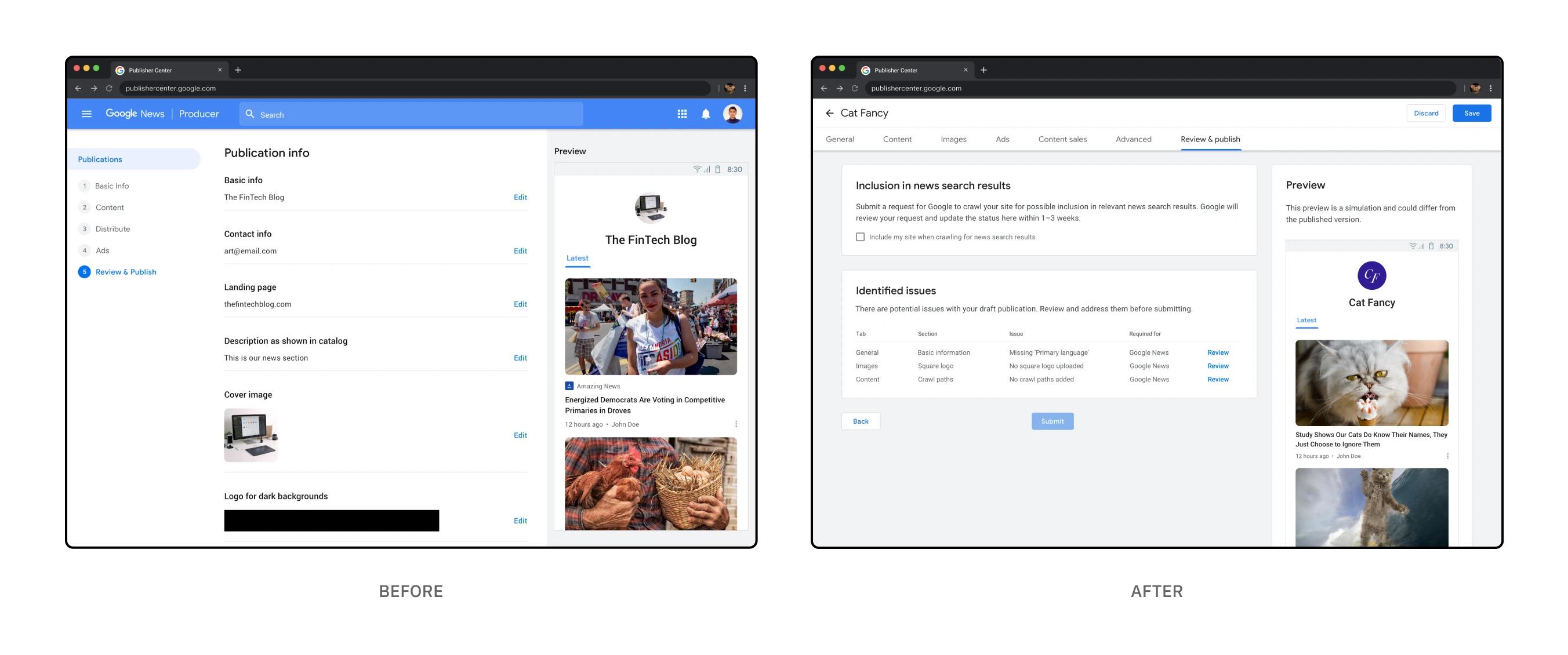
The "Before" and "After" for the "Review & Publish" page
The "Before" and "After" for the "Review & Publish" page
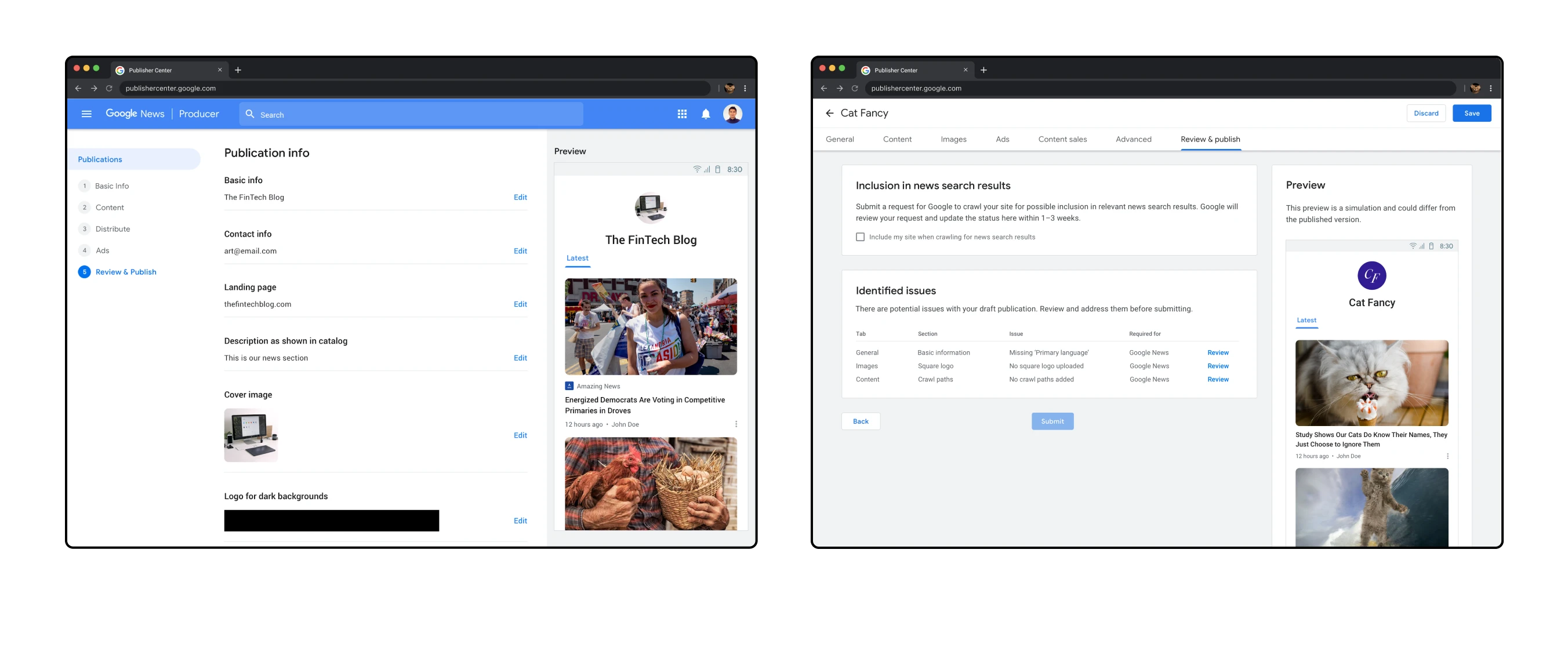
The "Before" and "After" for the "Review & Publish" page
The "Before" and "After" for the "Review & Publish" page
The previous "Review & Publish" screen was basically a read-only version of all the information submitted to that point. This seemed redundant as the user could simply go to a previous screen via the right-hand navigation. For the redesign we repurposed this page with new functionality that surfaces possible issues with submitting so that users can make the necessary changes. There would also be optional settings like the option of being included in Google search results.

The revised "Pricing options" table which allows publishers to set pricing for different countries
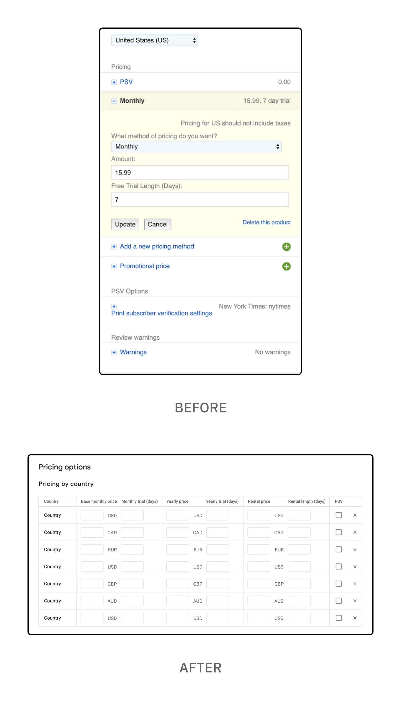
The revised "Pricing options" table which allows publishers to set pricing for different countries
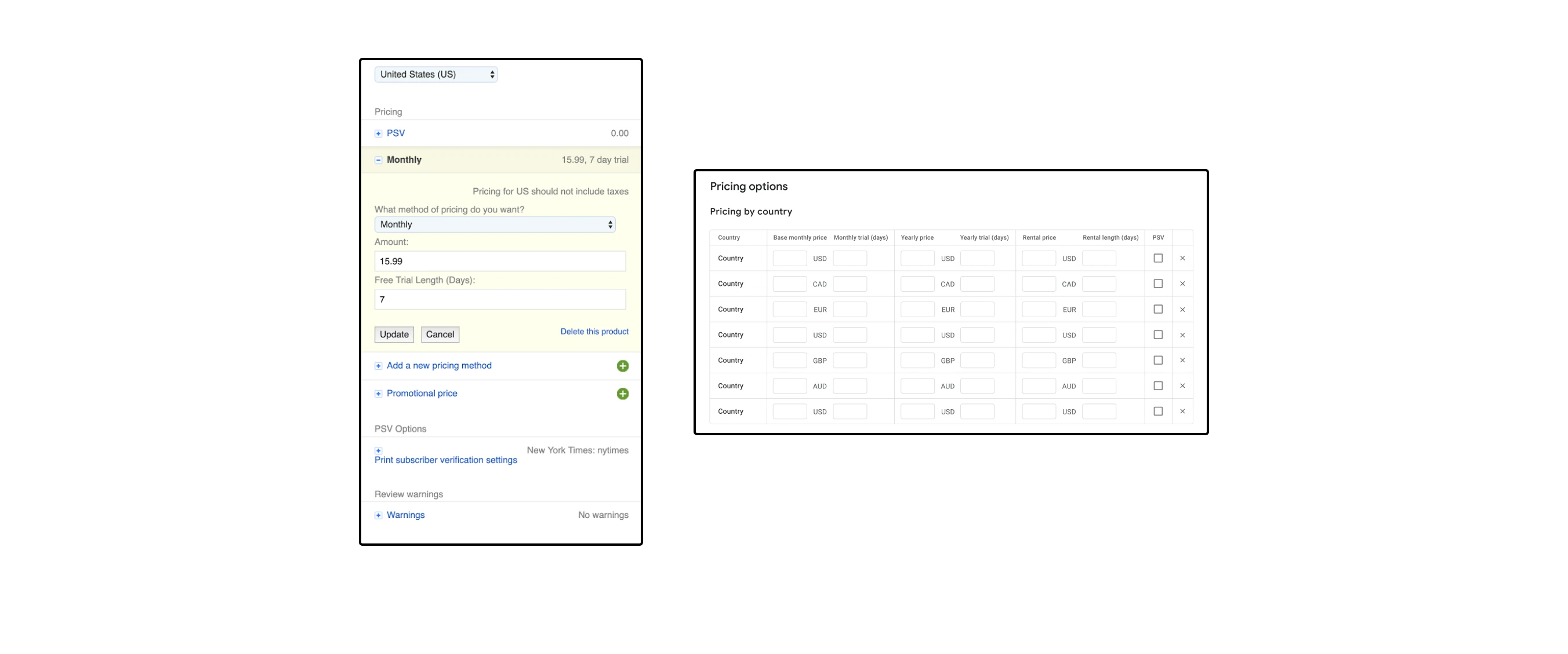
The revised "Pricing options" table which allows publishers to set pricing for different countries
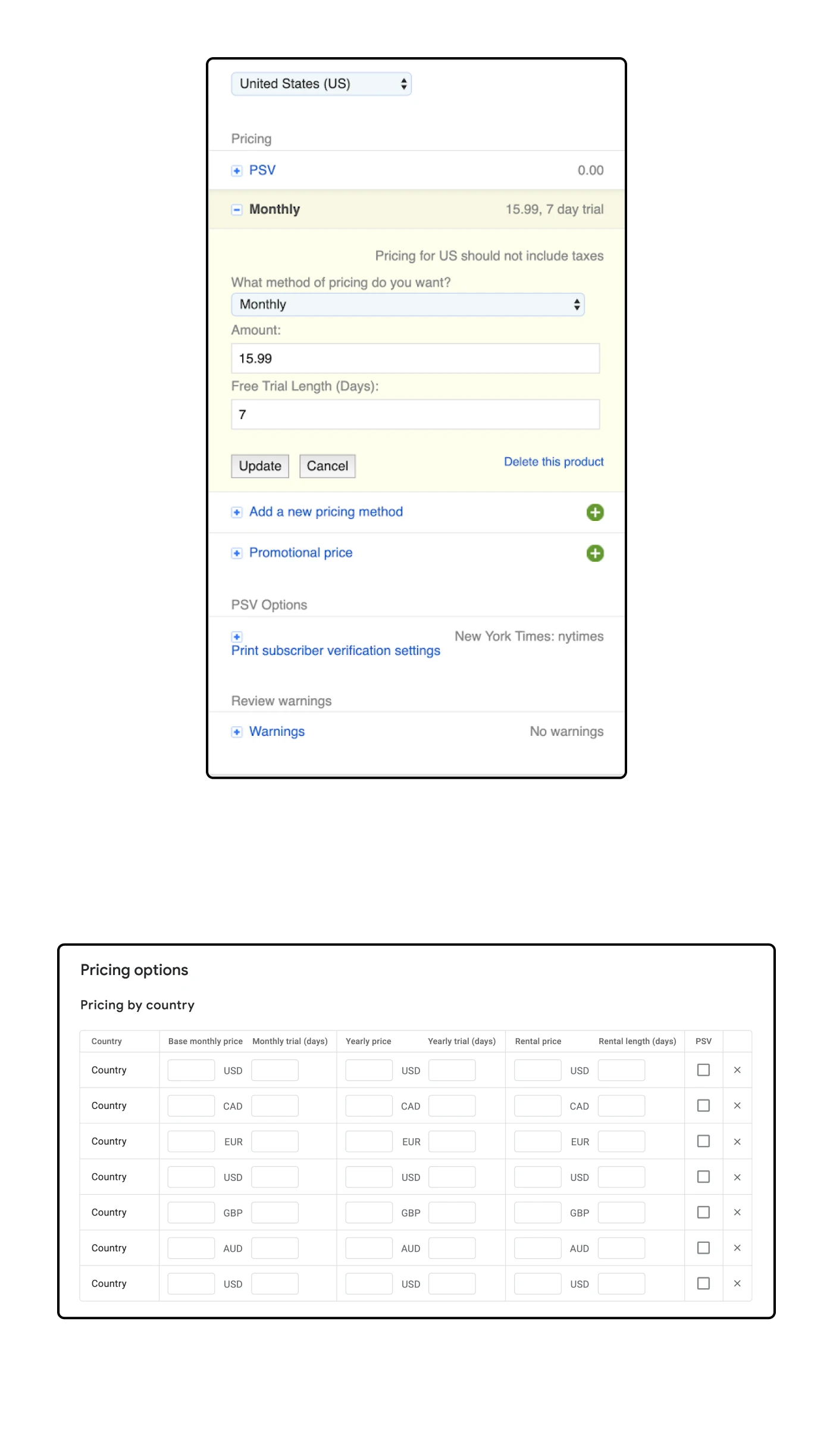
The revised "Pricing options" table which allows publishers to set pricing for different countries
Together with my team, I redesigned each screen, flow and individual component. In some cases this would be a straightforward Material design update. For others, this required additional functionality to improve the larger user experience. In the example above, I designed a table that made it easier for publishers to set pricing and other settings for multiple countries rather than have to set each country individually. This is just one example of revising the existing functionality to make it easier for users to make updates.
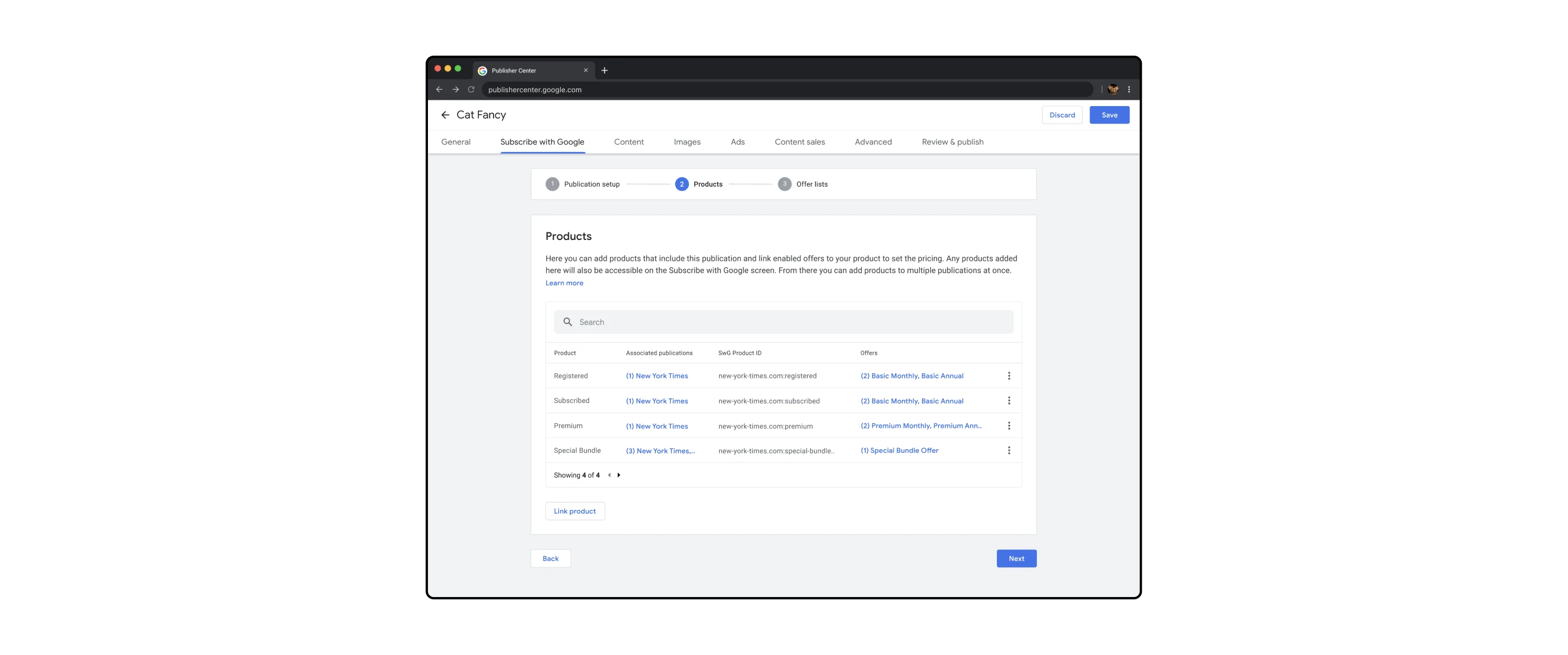
Setting up "Subscribe with Google" settings, a flow within the larger editing flow
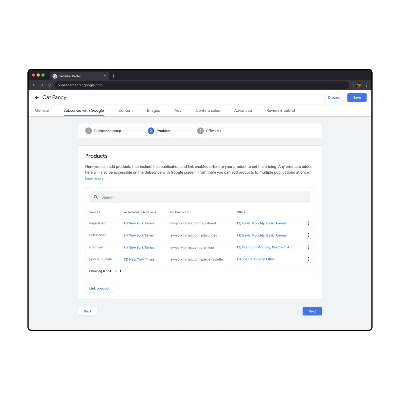
Setting up "Subscribe with Google" settings, a flow within the larger editing flow
Cross-functional collaboration was a huge part of this project. I worked closely with my product managers, engineering lead and UX writers. We would meet on a weekly basis to ensure that everyone was aligned with the designs. For design feedback I would meet with the other Google News designers as well as get advice from the Material design system team.
Content that is shared using Publisher Center is available to other Google properties such as Subscribe with Google, which allows Google users to easily subscribe to a publication through an existing Google account. I worked with the SwG PM on an integrated experience that allows publishers to set up their publications to be more easily purchased and accessed by Google users.
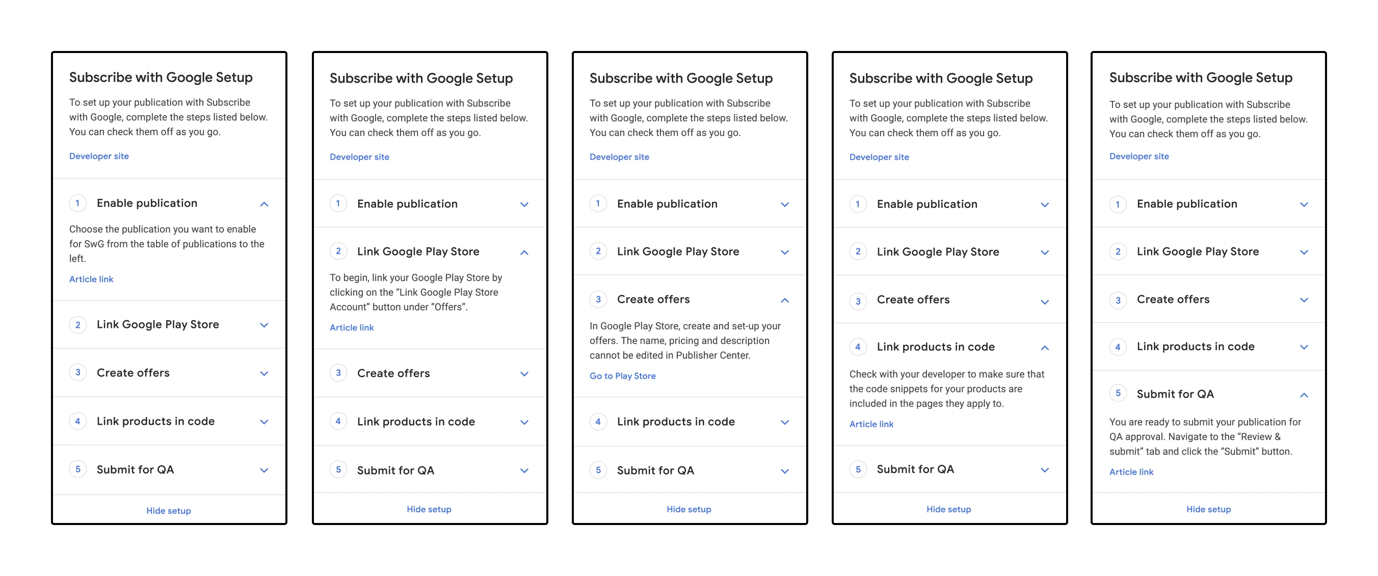
Set-up wizard for setting up Subscribe with Google, a process that involves various Google properties
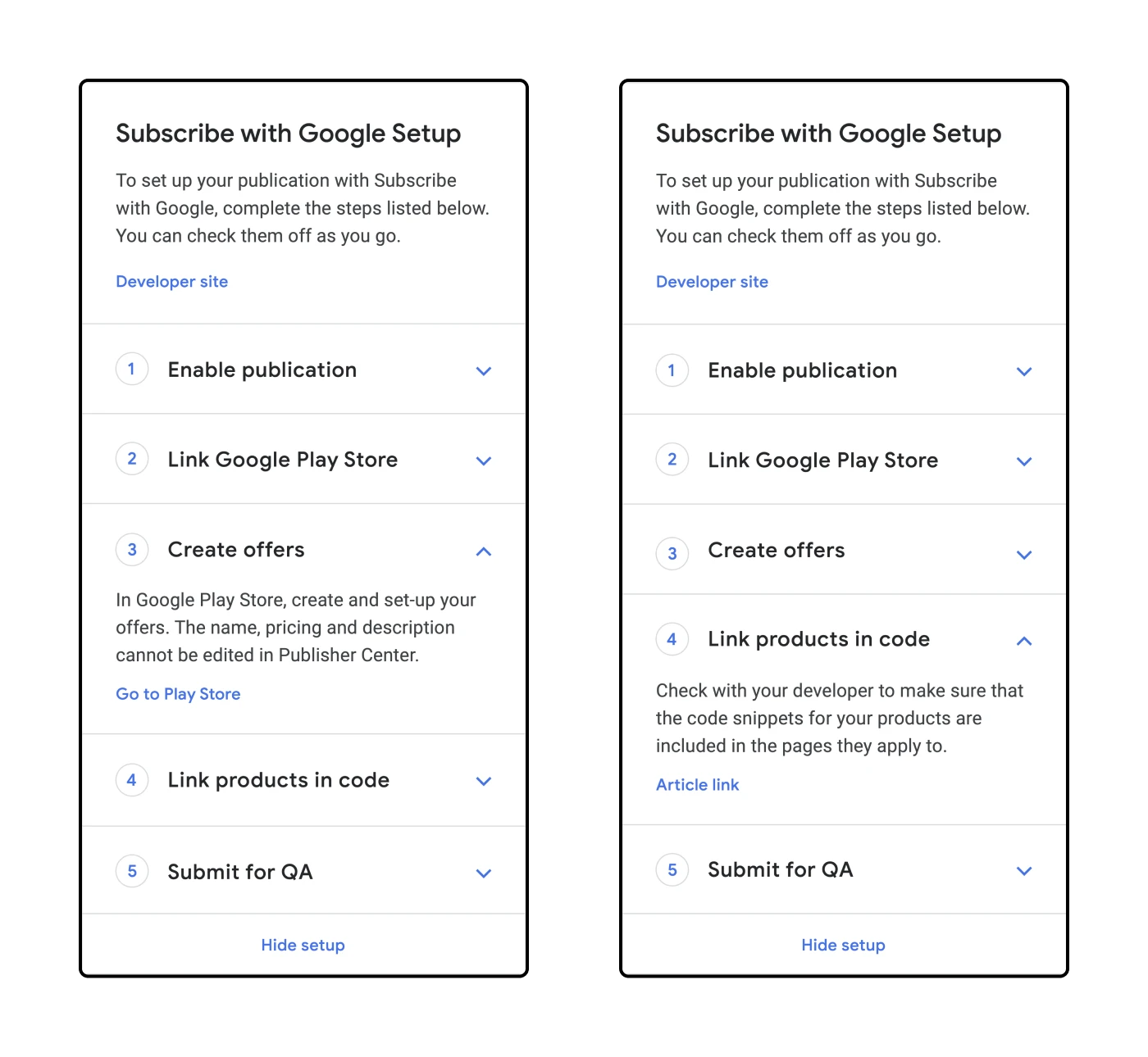
Set-up wizard for setting up Subscribe with Google, a process that involves various Google properties
As of 2024, over 20k publishers have content published on Google News. Content is distributed worldwide to an estimated ~142 million monthly active users, earning publishers billions in ad revenue thanks to a combination of Google News and Google Search.
Overall, I'm proud to have contributed to this project. This was my first project as a contractor at Google and I had a lot of ownership and responsibility. It was also my first experience working formally with UX writers which was very exciting for me!
This was a difficult product to design as it required careful consideration of a number of factors including Google's branding and design standards as well as the user expectations and their experience changing from a legacy application to a new one.
What stands out to me about Jamie's work was that she is a problem solver. Not just for the immediate product challenges but she would also tackle the inefficiencies and process roadblocks in the way of getting the job done. Jamie will be an asset to any design team and they would be lucky to have her.
— Chuck Garofalo
engineering manager